WEB112 » Setting Type for the Web
As much as the choice of type is important, the appropriate use of typographic measurements and white-space is an important tool of the trade when setting type for the web.
View: Bio Page Two | Premium Design Works
Download: Bio Page Two | Premium Design Works
Following Typographic Traditions
The rules of how to set type properly are relatively comprehensive, universal and a bit formulaic. By following the following rules, you will achieve readability in your copy design.
See Also:
- The Rules of Setting Readable Type | Premium Design Works
- Typography Design for the Web | Premium Design Works
Using a Proper Markup
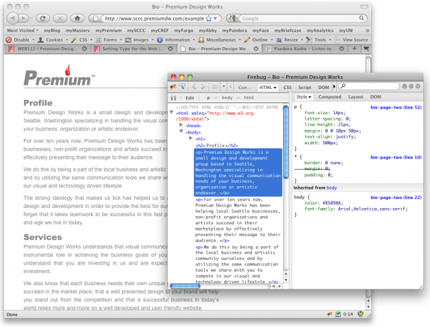
To set type for the web we must first have a good hierarchy to our markup:
1 2 3 4 5 6 7 8 9 10 11 12 13 14 15 |
<body>
<h1><img src="images/logo.gif" alt="Premium Design Works" /></h1>
<h2>Profile</h2>
<p>Premium Design Works is a small design and development group based in Seattle, Washington specializing in handling the visual communication needs of your business, organization or artistic endeavor.</p>
<p>For over ten years now, Premium Design Works has been helping local Seattle businesses, non-profit organizations and artists succeed in their marketplace by effectively presenting their message to their audience.</p>
<p>We do this by being a part of the local business and artistic community ourselves and by utilizing the same communication tools we share with you to compete in our visual and technology driven lifestyle.</p>
<p>The strong ideology that makes us tick has helped us to refine our process of design and development in order to provide the best for our clients. But we don't forget that it takes teamwork to be successful in this fast paced information day and age we live in today.</p>
<h2>Services</h2>
<p>Premium Design Works understands that visual communication services play an instrumental role in achieving the business goals of your company. We also understand that you are investing in us and are expecting a return on that investment.</p>
<p>We also know that each business needs their own unique strategy to help them succeed in the market place, that a well presented design to your brand will help you stand out from the competition and that a successful business in today’s world relies more and more on a well developed and user friendly website.</p>
<h2>Contact</h2>
<p>13612 14th Avenue South<br />Burien, Washington 98168</p>
<p>206.851.7636</p>
<p><i><a href="mailto:msinkula@premiumdw.com">msinkula@premiumdw.com >></a></i></p>
</body>
|
See Also: Coding Clean and Semantic Templates | Web Designer Wall
Using a Style Sheet
Download: Bio Page Two | Premium Design Works
We must also use style sheets effectively to control our presentation:
1 2 3 4 5 6 7 8 9 10 11 12 13 14 15 16 17 18 19 20 21 22 23 24 25 26 27 28 29 30 31 32 33 34 35 36 37 38 39 40 41 42 43 44 45 46 47 48 49 50 51 52 53 54 55 56 57 58 59 60 61 62 63 |
* { margin: 0; padding: 0; border: 0; }

@font-face {
font-family: 'ArialMTStdBlack';
src: url('fonts/arialmtstd-black-webfont.eot?') format('eot'),
url('fonts/arialmtstd-black-webfont.woff') format('woff'),
url('fonts/arialmtstd-black-webfont.ttf') format('truetype'),
url('fonts/arialmtstd-black-webfont.svg#webfontvXHkqCMg') format('svg');
font-weight: normal;
font-style: normal;
}

body {
background-color:#FFFFFF;
font-family: Arial, Helvetica, sans-serif;
color: #85898A;
margin: 0;
padding: 0;
}

h1 {
width: 500px;
margin-top: 25px;
margin-right: 0px;
margin-bottom: 20px;
margin-left: 50px;
border-bottom: 1px solid #85898A;
}

h2 {
width: 500px;
font-family: ArialMTStdBlack, Arial, Helvetica, sans-serif;
font-size: 21px;
line-height: 21px;
font-weight: normal !important ;
font-style: normal;
padding-top: 8px;
margin-right: 0px;
margin-bottom: 2px;
margin-left: 50px;
}

p {
width: 500px;
font-size: 14px;
line-height: 21px;
letter-spacing: 0px;
text-align: justify;
margin-top: 0px;
margin-right: 0px;
margin-bottom: 10px;
margin-left: 50px;
}

a {
color:#85898A;
text-decoration: underline;
}

a:hover {
color:#F20017;
text-decoration: none;
}
|
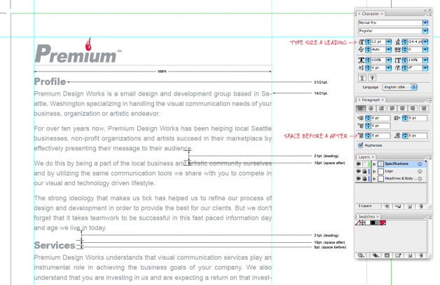
Font Size: refers the the size of the font being used
1 |
font-size: 10px;
|
Line Height: refers to the space from baseline to baseline within a paragraph—also referred to as leading
1 |
line-height: 21px;
|
Letter Spacing: refers to the space between individual letter pairs—also referred to as kerning or tracking
1 |
letter-spacing: normal;
|
Text Align: the property that allows you to align text to be center, left, right or forced justified
1 |
text-align: left;
|
Space Before & After: the principal of giving space before or after a headline or paragraph for readability and comprehension—also referred to as margin bottom or top
1 |
margin-bottom: 10px;
|
See Also:
- Typographic Contrast and Flow | Web Designer Wall
- Setting Type on the Web to a Baseline Grid | A List Apart
- 5 Principles And Ideas Of Setting Type On The Web | Smashing Magazine
This portion of the Premium Design Works website is written by Mike Sinkula for the Web Design & Development students at Seattle Central College and the Human Centered Design & Engineering students at the University of Washington.


1 Comment:
Some useful pointers I hope to abide by myself.
http://www.netmagazine.com/features/better-web-typography-few-simple-steps
Trackbacks: