WEB200 » Navigation Design for the Web
People will not use your website if they cannot find their way around it.

Dictionary Version 2.0.3 (51.5) by Apple Inc.
Scene from a Mall
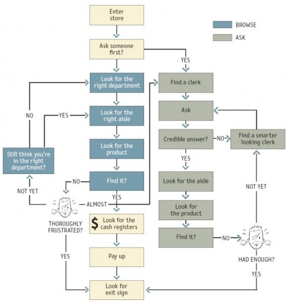
As you walk into a store looking for something you need you will inevitably use the store’s navigation system to aid you in finding your product:
See Also: Navigating Home Depot
A typical shopping scenario goes something like this:
- Enter the store
- Look overhead for the names of departments
- Look at the signs to see the names of each aisle
- Look at the individual sections of products
- Find your product
Web Navigation 101
Just like you look for clues in a department store, you also look for those same clues when using a website:
- You are usually trying to find something
- You decide whether to ask first or browse first
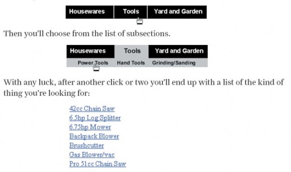
- If you choose to browse, you make your way through a heirarchy, using signs to guide you
- If you can’t find what you are looking for, you leave
The Overlooked Purpose of Navigation
Navigation isn’t just a feature of a website, it is the website.
Navigation’s main role in a website is fairly obvious, it helps us find us what we are looking for. But, navigation also serves other purposes:
- It gives us something to hold on to
- It tells us what’s there
- It tells us how to use the site
- It gives us confidence in the people who designed and built the site
Website Navigation Conventions
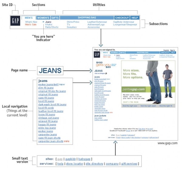
Putting your navigation in a standard place and using a proven convention will allow the user to locate the navigation more quickly and be able to use it more easily.
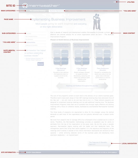
Typical navigation schemes include:
- Site ID: this is also link back to the home page
- Main Category Section: global navigation
- Sub-Category Sections: sub navigation
- Page Name: where you are in the site
- Footer: extra site information outside the normal hierarchy of pages
You are Here?
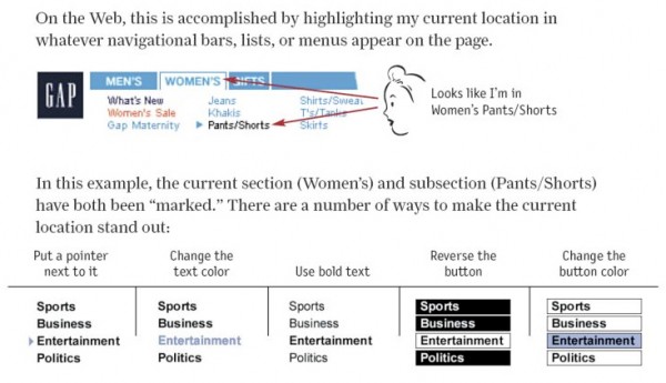
One of the ways that navigation can help someone not feel lost within the site is to use the “you are here” indicators.
These indicators can be as simple as using a page name and/or using the highlight state of your navigation to announce what page the user is on.
Putting it Together
You: Great Mike… again, thanks for all of the screenshots. But, now how do I put all of this stuff together.
Me: How about we take a look at my example and we can talk about how I put all of this stuff together. Sound good?
See Also:
- Is Navigation Useful? | Nielsen Norman Group
- Horizontal Navigation Menus: Trends, Patterns And Best Practices | Smashing Magazine
- Responsive Navigation Patterns | Brad Frost Web
- Mobile Navigation: Image Grids or Text Lists? | Nielsen Norman Group
This portion of the Premium Design Works website is written by Mike Sinkula for the Web Design & Development students at Seattle Central College and the Human Centered Design & Engineering students at the University of Washington.


13 Comments:
Great jump off point into list item builds..
http://css.maxdesign.com.au/listamatic/
Nice!
Great article that that talks about eye-tracking. Especially coparing the similarities of facebook and Google+
http://allthingsd.com/20110811/eye-tracking-study-shows-users-perceive-google-and-facebook-virtually-identically/
Great article that that talks about eye-tracking. Especially coparing the similarities of facebook and Google+
Jakob Nielsen’s 2003 article The Ten Most Violated Homepage Design Guidelines mentions that if you do use a home page link, don’t include an active link to the homepage on the homepage.
BBC Site Redesign Eloquently Explained…
http://www.bbc.co.uk/blogs/bbcinternet/2010/02/a_new_global_visual_language_f.html
I started looking at Mike’s examples here, and wandered off one of them to a site/blog that really interested me: an in-depth description of a redesign, how they thought it out and the graphic elements they adopted. I hope you enjoy it.
Nice… I added this to my resources page!
A cool site with very simple navigation. I liked it so much I wanted to share it.
http://www.doublehappycreative.com/
I came across a great page about using color and gradients in logos. These tend to look better on the web than in print (business cards being an example) but they work good on-screen. Check them out at http://abduzeedo.com/great-examples-colorful-gradients-and-3d-effects-logos .
Here’s a great article about navigation: a gallery of 50 beautiful and user-friendly menu systems. It’s good inspiration!
http://www.smashingmagazine.com/2009/02/04/50-beautiful-and-user-friendly-navigation-menus/
Trevor
I looked for a web site to use as an example for good navigation and I came across http://www.works4sure.nl . I don’t even know what language this site is in but I still understood how everything worked. I think it’s a great example of good navigation and following established patterns for page layout.
here’s the tutorial found on active menu items in CSS. I’ve already used it in a site and it works great. It’s really simple and easy to use.
http://www.456bereastreet.com/archive/200503/setting_the_current_menu_state_with_css/
maybe you can put it on the blog or show it to the class because I know everyone wants to use it.
Trackbacks:
[…] can read the lectures here and […]