WEB202 » Interaction Design
Interaction design is the discipline of creating a structured experience for the user. It concerns itself with describing possible user behavior and defining how the system will accommodate and respond to that behavior.
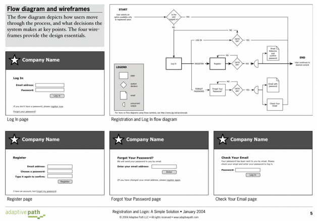
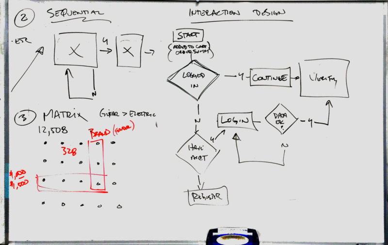
Interaction designers typically use flowcharts to describe the options involved in performing and completing user tasks:
See Also:
- Shapes of the Visual Vocabulary | Jesse James Garret
- Visual Vocabulary Cheat Sheet | Jesse James Garrett
- Visual Vocabulary for Information Architecture | Jesse James Garrett
- Registration & Login: A Simple Solution | AdaptivePath
Early in the days of programming the focus was on what the computer system did and how it did it – but eventually we started catching on to the idea that instead of designing software to just work for computer efficiency sake, we realized that it was a need to design software for the efficiency of the user as well.
Conceptual Models
Conceptual models are the impressions of the users of how the components we create will behave – users come in with their own mental model of how it should work.
Knowing your conceptual model will allow you to make consistent decisions based from the users mental model of how a site should work.
An example of a conceptual model would be a typical shopping cart – where the user comes in with the impression that they can put things in the shopping cart and take them out and even put more in before they go up to the register to actually check out:
This example has been so widely used on the web that it is now a convention – and if broken you risk confusing the user where they might leave to go find a site with the shopping cart they are used to.
Using conceptual models that people are familiar with makes them feel about adapting to your site that they’ve never been to before.
Ideally, the users won’t have to be told what conceptual model we’re following – they should pick it up intuitively as they use the site because it matches their expectations.
Error Handling
Let’s face facts that people are in a hurry and they are going to make mistakes – so what are you going to do when they make mistakes?
The first and most obvious defense against errors is to merely design the website so it is “error proof,” right? – Easier said than done.
By using conceptual models based off of research you can make errors less likely and even difficult to make – but even some are about to happen.
They website should do what it can to help the user figure out what they’ve done wrong and help them recover from their error – “Are you sure you want to do that?”
This portion of the Premium Design Works website is written by Mike Sinkula for the Web Design & Development students at Seattle Central College and the Human Centered Design & Engineering students at the University of Washington.


3 Comments:
Google Analytics Shows You What Bad Web Practices Look Like in Real Life
http://mashable.com/2012/12/16/google-analytics-real-life/
http://theoatmeal.com/comics/shopping_cart
That’s pretty much, “What I’m Sayin’.”
Trackbacks: