WEB112 » History of the Font
Bitmap v. Outline
Since digital devices like computer monitors, desktop printers, image-setters, etc. create images out of dots, the easiest way to create type for these devices was the convert the characters of a typeface into a series of dots. The digital device would then copy these dots in place onto the screen or page.
When this technology was first being figured out, each one of these dots was represented by one bit of computer data. Images created from these prearranged arrays of dots were called “bitmaps” and thus these fonts were called Bitmap Fonts:
Bitmap Fonts were a clever and simple approach, but the more dots a bitmap contained the more computer data it required. So, as the resolution of the devices increased, need for separate bitmapped fonts for separate devices became a problem.
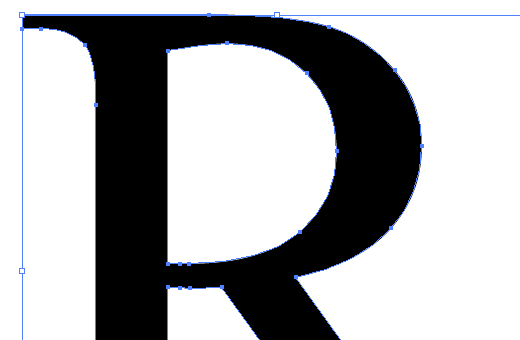
The solution to this problem was to store the description of the characters in these fonts in a set of outline drawings. Outline Fonts store character images as outlines described mathematically as a series of curved and straight line segments with a fill—also known as vector format.
These outlines of vector formatted fonts can then be scaled mathematically without distorting the shapes of the images:
What’s in a Font?
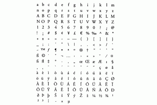
The entire collection of character outlines in a font is called the Character-Set:
When it comes time to print, the computer will access these character-outlines of the character-set and use the width-table and kerning-table to correctly image the font for printing:
- Width-Table: lists the horizontal space allotted to each character (bounding box)
- Kerning-Table: lists specific letter pairs and how the program should adjust the spacing between them
Font Formats
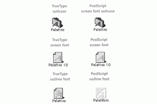
PostScript: PostScript fonts are the standard in the publishing industry. They are written in the PostScript page description language and need to be processed by a PostScript interpreter before they can be imaged by the printer. For high-resolution printers, this interpreter is built into the printer device itself for output. Lower-resolution printers may rely on the interpreter that may be built into the operating system of the computer (like Adobe Type Manager).
PostScript fonts are also usually accompanied by a bitmapped screen version of the font for on-screen display, also called a screen-font:
TrueType: In the 1980’s Apple and Microsoft collaborated on a font format called TrueType, which allowed both companies and operating systems to use the same font across platforms without needing to rely on Adobe technology.
TrueType fonts prominently relied on what was called hinting, which were instructions added to the font itself which tell the characters how to reshape themselves at low and medium resolution for maximum clarity. Hinting allowed for use on both screen and in print so separate screen and printer fonts were not needed.
OpenType: a hybrid font format created by Adobe and Microsoft which reconciled the differences in the two previous formats and are able to be used across both platforms… sometimes.
The vast majority of fonts today do not use the OpenType format which means that fonts are generally either PostScript or TrueType Mac or TrueType PC fonts. However Window’s Arial has the same character-width as the Mac’s Helvetica as do many other fonts and their platform’s counterpart which aide in cross-platform issues.
Both the PC and Mac ship with a standard set of fonts that has a counterpart on the other platform so documents can easily be read across platforms.
This portion of the Premium Design Works website is written by Mike Sinkula for the Web Design & Development students at Seattle Central College and the Human Centered Design & Engineering students at the University of Washington.


3 Comments:
Fun piece on NPR about Sweden designing its own font. Listen or read here:
http://www.npr.org/blogs/parallels/2015/02/06/384346383/not-too-much-not-too-little-sweden-in-a-font
please check out steve jobs’ 2005 stanford university commencement address. he speaks on how his love of calligraphy (pre mac) is now why we have fonts on our computers…
http://www.npr.org/2011/10/06/141122856/steve-jobs-speech-at-stanford-university
http://www.squidspot.com/Periodic_Table_of_Typefaces/Periodic_Table_of_Typefaces_large.jpg
This is an amusing representation of typefaces. I didn’t realize there are so many that look (almost) exactly alike…
Trackbacks: