WEB112 » Graphic Type on the Web
Controlling the attributes of text is much easier and precise by using a graphic program like Adobe® PhotoShop or Illustrator. But, there are things to consider and many drawbacks.
Using Graphic Type on the Web
There are up-sides and down-sides to using graphic web type. Therefore, you must consider all of the options before you choose which method, graphic or text, you will use for your web page design.
Pros of Graphic Web Type:
- Style and Brand: are easily carried out by using graphic menus and some headlines, as you can use the same font of the logo to achieve a nice overall look
- Mood: can be achieved by using graphical text as you can use a decorative font
- Choices: creating type in a graphics program will give you more typefaces to choose from
See Also: CSS Zen Garden
Cons of Graphic Web Type:
- File size: graphic type will require more bandwidth
- Flexibility: gets reduced when page widths need to contract and expand
- Editability: is slower because you need to modify graphics in a graphics program, re-optimize and replace
- Readability: serifs that are easier to read in the print world will be harder to read on a monitor
Rasterizing Graphic Web Type
Any element displayed on a monitor is made up of thousands of little squares called pixels. So, when an object has a vertical or horizontal edge, the image appears crisp.
However, when you have a curve or a diagonal edge, the curve or diagonal must be approximated with pixels of different shades—the eye will blend the colors of the pixels to create the illusion of the shape:
Choosing an appropriate typeface and rendering it at an appropriate size is imperative when it comes to graphic web type.
Thinly designed typefaces with curved lines have very few pixels to work with and thus render poorly at smaller sizes. Blocky and upright designed fonts usually have a better chance at survival.
Choosing a File Format
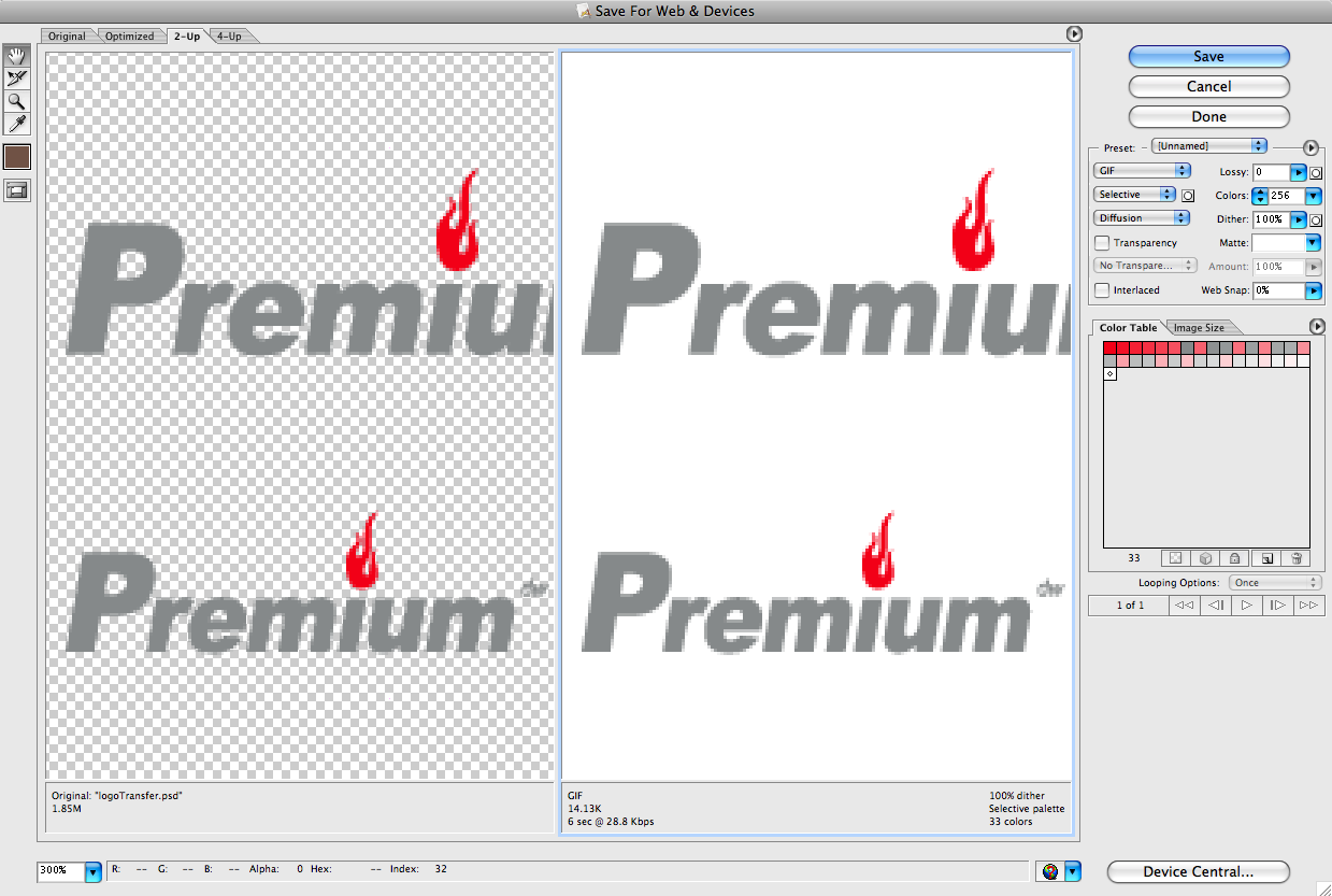
When we save our images for our websites, we will be using the save for web command by choosing File > Save for Web:
Image files are composed of either pixel or vector (geometric) data that are rasterized to pixels when displayed (with few exceptions) in a vector graphic display. Images are not technically inserted into an HTML page, rather, images are linked to HTML pages.
First and foremost, your images that you will use in your web page need to be in the proper format to be viewed in a standard web browser. We will also be saving our files as 72 ppi (pixels per inch) – the standard resolution for web images.
There are four main formats to use in your web pages:
- Graphics Interchange Format (GIF) is limited to an 8-bit palette, or 256 colors. This makes the GIF format suitable for storing graphics with relatively few colors such as simple diagrams, shapes, logos and cartoon style images.
- Joint Photographic Experts Group (JPEG) is a compression method. Nearly every digital camera can save images in the JPEG format, which supports 8 bits per color (red, green, blue) for a 24-bit total, producing relatively small files. When not too great, the compression does not noticeably detract from the image’s quality, but JPEG files suffer generational degradation when repeatedly edited and saved.
- Portable Network Graphics (PNG) file format was created as the free, open-source successor to the GIF. The PNG file format supports truecolor (16 million colors) while the GIF supports only 256 colors. The PNG file excels when the image has large, uniformly colored areas.
- Scalable Vector Graphics (SVG) is an XML-based vector image format for two-dimensional graphics with support for interactivity and animation. The SVG specification is an open standard developed by the World Wide Web Consortium (W3C) since 1999.
See Also: Using SVGs | CSS Tricks
This portion of the Premium Design Works website is written by Mike Sinkula for the Web Design & Development students at Seattle Central College and the Human Centered Design & Engineering students at the University of Washington.


2 Comments:
A set of examples that show just how powerful SVGs can be.
https://youtu.be/wc8ovZZ78SY
Great site with working type on a web grid…
http://csswizardry.com/typogridphy/
Trackbacks: