HCDE532 » Make Your Website Responsive
Here is where we are going to take all of our hard work so far and make it look nice for mobile devices.
I recommend reading Responsive Web Design by Ethan Marcotte. It’s something that you can read in a night and it will cover all of the basics you need to know.
See Also: Convert a 960 Grid Website to a Responsive Design | Premium Design Works
View: http://faculty.washington.edu/sinkum/make-your-website-responsive/
Code: https://github.com/msinkula/HCDE598/tree/master/make-your-website-responsive
Step One: Place The Viewport Meta Tag
The first thing that you will need to know is that you will need to have your website inform the devices how to display your content correctly using the viewport meta tag:
1 2 3 |
<!-- Begin Meta -->
<meta name="viewport" content="user-scalable=no, initial-scale=1.0, maximum-scale=1.0" />
<!-- End Meta -->
|
See Also:
- Using the viewport meta tag to control layout on mobile browsers – Mobile | Mozilla Developer Network
- Responsive Web Design – The Viewport | W3Schools
- Mobile and Tablet Viewport Sizes with screen DPI and size | i-Skool
- Viewport Sizes | ViewportSizes.com
- Safari Web Content Guide: Configuring the Viewport | iOS Developer Library
Let’s place this in our header.php file inside the <head> tag:
Step Two: Make Your Typography Responsive
The first thing that we need to do is to set all base font sizes and line heights in your css file.
Let’s reset the font-size in our <body> selector:
1 2 3 |
body {
font-size: 100%; /* sets all type sizes to a default 16px */
}
|
We can now change the font-size and line-height in some of the other selectors:
1 2 3 4 |
h1 {
font-size: 2.25em; /* 36px */
line-height: 100%; /* 36px */
}
|
1 2 3 4 |
h2 {
font-size: 1.5em; /* 24px */
line-height: 100%; /* 24px */
}
|
1 2 3 4 |
h3 {
font-size: 1.125em; /* 18px */
line-height: 100%; /* 18px */
}
|
1 2 3 4 |
p {
font-size: 1em;  /* 16px */
line-height: 150%; /* 24px */
}
|
1 2 3 4 |
ol, ul {
font-size: 1em;  /* 16px */
line-height: 150%; /* 24px */
}
|
Basically, if we did this correctly, our type should adhere to our originally set specifications. We are just now using ems and percentages as recommended for responsive design.
See Also: Why Ems? | CSS-Tricks
Step Three: Make Your Images Responsive
We will need to get used to the idea that our images and media will need to scale according to their parent elements.
Download: http://faculty.washington.edu/sinkum/2015/images/img-graduation.jpg
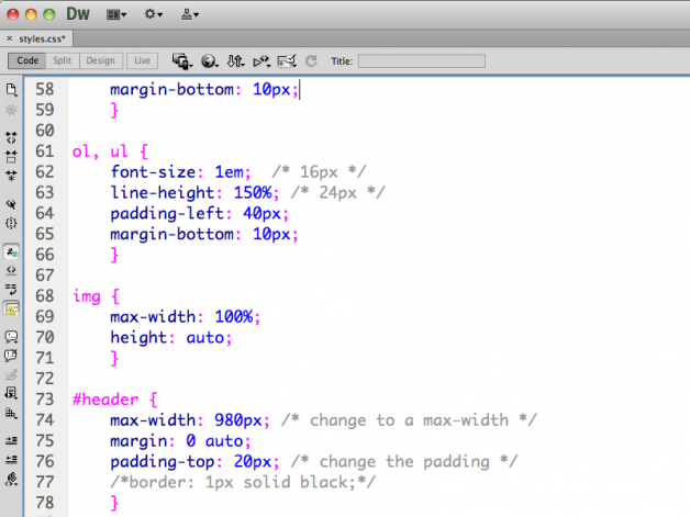
To make this happen, let’s set all <img> tags to a “max-width” of 100% and a height of “auto”:
1 2 3 4 |
img {
max-width: 100%;
height: auto;
}
|
We can place this near the top of our style sheet:
Step Four: Make Your Layout Responsive
Here is where we can start making our layout look fluid when we reduce in size. This will take some work to complete, but it should be fun.
First, let’s change our parent <div> elements to a “max-width” as well:
1 2 3 |
#header {
max-width: 980px; /* change to a max-width */
}
|
1 2 3 |
#navigation {
max-width: 980px; /* change to a max-width */
}
|
1 2 3 |
#content {
max-width: 940px; /* change to a max-width */
}
|
1 2 3 |
#footer {
max-width: 980px; /* change to a max-width */
}
|
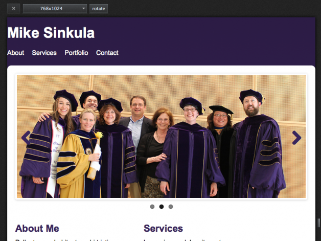
We should now see our website scale responsively to the browser resolutions:
Notice that since we used Flexslider, our image gallery now responds!
Now that our parent elements are responsive, we need to make all of the child elements responsive as well.
Here is where we are going to start using media queries to make our child elements adhere to percentages of the max-width of their parent elements.
See Also:
CSS Media Queries | Mozilla Developer Network
Grids | Mozilla Developer Network
1 2 3 4 |
/* Desktop Screen Set to 1024px or Below */
@media screen and (max-width: 1024px) {

}
|
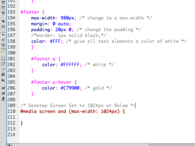
We will want to add this to the bottom of our style sheet:
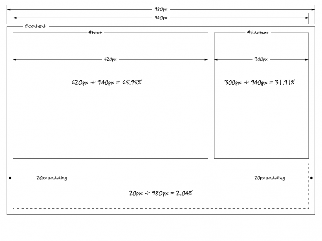
We can then change the width of our child elements and the horizontal padding of the parent element to percentages.
Let’s change some things as we get below 1024px wide:
1 2 3 4 5 6 7 8 9 10 11 12 13 14 15 16 17 18 19 20 21 |
/* Desktop Screen Set to 1024px or Below */
@media screen and (max-width: 1024px) {

#content {
padding: 20px 02.04%; /* 20px / 980px */
}

#text {
width: 65.95%; /* 620px / 940px */
}

#sidebar {
width: 31.91%; /* 300px / 940px */
}

#widgets section.widget-item {
width: 31.91%; /* 300px / 940px */
margin-right: 02.12%; /* 20px / 940px */
}

}
|
Let’s explain the math used here:
We should now see our columns respond to the browser resolution!
Now that we have set our elements to scale accordingly, we need to make some choices as things scale down for mobile devices.
See Also:
- Mobile and Tablet Viewport Sizes with screen DPI and size | i-Skool
- Viewport Sizes | ViewportSizes.com
Let’s make things look good at 800px and below for tablets:
1 2 3 4 5 6 7 8 9 10 11 12 13 14 15 16 17 18 19 20 21 22 23 |
/* Tablet Screen Set to 800px or Below  */
@media screen and (max-width: 800px) {

#header {
padding-left: 02.04%; /* 20px / 980px */
padding-right: 02.04%;
}

#navigation {
padding-left: 02.04%;
padding-right: 02.04%;
}

#content {
border-radius: 0px; /* removes rounded corners */
}

#footer {
padding-left: 02.04%;
padding-right: 02.04%;
}

}
|
Lastly, let’s make things look good at 600px and below for mobile phones:
1 2 3 4 5 6 7 8 9 10 11 12 13 14 15 16 17 18 19 20 21 22 23 24 25 26 27 28 29 30 31 32 33 34 35 36 37 38 39 40 |
/* Mobile Screen Set to 600px or Below  */
@media screen and (max-width: 600px) {

#header {
padding-left: 10px;
padding-right: 10px;
}

#navigation {
padding-left: 10px;
padding-right: 10px;
}

#content {
padding: 20px 10px;
}

#text {
width: 100%;
float: none;
}

#sidebar {
width: 100%;
float: none;
}

#widgets section.widget-item {
width: 100%;
float: none;
margin-right: 0;
margin-bottom: 20px;
}

#footer {
padding-left: 10px;
padding-right: 10px;
}

}
|
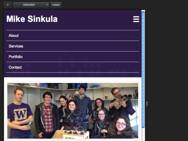
Now our website looks good on phones!
Step Five: Create a Toggle Menu
Here’s where we can take things one step further by adding a menu system tailored to mobile devices. Let’s go with a toggle style menu.
See Also: Responsive Navigation Patterns | Brad Frost Web
First, we are going to need the image for the toggle menu:
Download: img-toggle.png
Go ahead and place this in your images folder.
Now, let’s place it in our header.php file inside our header element:
1 2 3 4 5 6 |
<!-- Begin Header -->
<div id="header">
<h1 id="logo"><a href="index.php">Mike Sinkula</a></h1>
<img id="toggle" src="images/img-toggle.png" width="25" height="25" alt="Toggle Menu">
</div>
<!-- End Header -->
|
Or, we can use a glyph instead of an image:
1 2 3 4 5 |
<!-- Start Toggle -->
<div id="toggle">
<a href="#"><span class="glyph">≡</span> Menu</>
</div>
<!-- End Toggle -->
|
Notice that I have given IDs to both my logo and this toggle image. We will need these for the style sheet and the jQuery.
If we preview, we will notice that our image is there. But, it is sure out of place.
Because we don’t need this image to be visible until our mobile phone resolution, let’s create a style to hide it :
1 2 3 |
#toggle {
display: none;
}
|
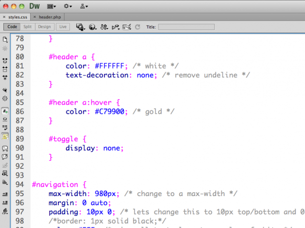
We can place this near the top of our style sheet:
Next, we will want to make the image visible at our 600px break point and float it to the right. We will also need to adjust our logo a bit to float left and hide our navigation:
1 2 3 4 5 6 7 8 9 10 11 12 13 14 15 16 17 18 19 20 |
#header {
padding-left: 10px;
padding-right: 10px;
overflow: hidden; /* prevent the great collapse */
}

#logo {
float: left; /* float our logo left */
}

#toggle {
display: block; /* make our toggle visible */
float: right; /* float our toggle right */
}

#navigation {
display: none; /* hide our navigation */
padding-left: 10px;
padding-right: 10px;
}
|
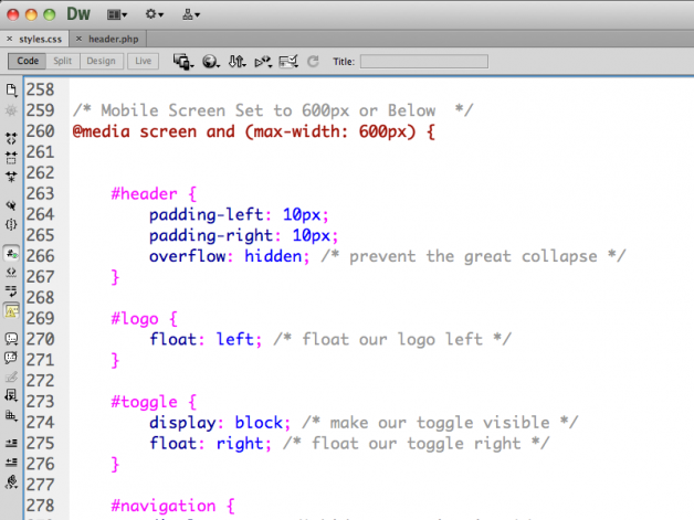
We can make these edits within our 600px media query:
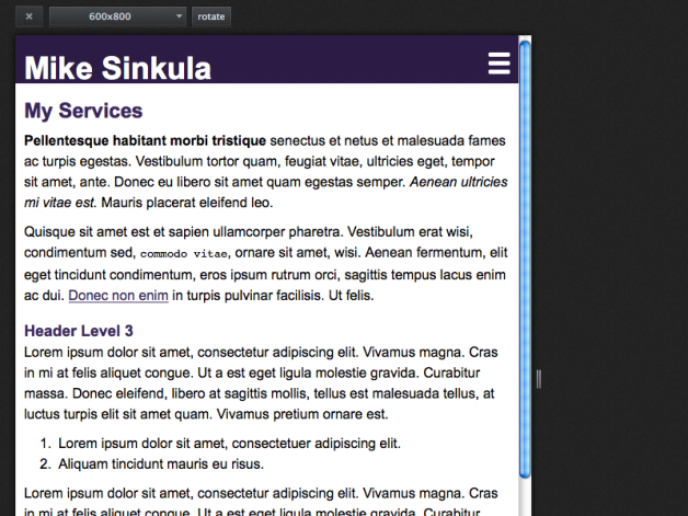
We should now see the edits in play at 600px wide:
Here’s where we need to make all of this work with a bit of jQuery.
First, make sure you have linked to the jQuery JavaScript library:
1 |
<script src="https://ajax.googleapis.com/ajax/libs/jquery/1.6.2/jquery.min.js"></script>
|
See Also: https://developers.google.com/speed/libraries/#jquery
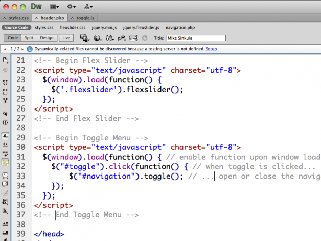
Then, we can write in the bit of jQuery to control the toggle menu:
1 2 3 4 5 6 7 8 9 |
<!-- Begin Toggle Menu -->
<script type="text/javascript" charset="utf-8">
$(window).load(function() { // enable function upon window load
$("#toggle").click(function() { // when toggle is clicked...
$("#navigation").toggle(); // ... open or close the navigation
});
});
</script>
<!-- End Toggle Menu -->
|
Let’s place this in our header.php file:
We should now see our toggle menu in play!
We can also expand on this toggle menu to perform other tasks like showing and hiding the menu upon window resize:
1 2 3 4 5 6 7 8 9 10 11 12 13 14 15 16 17 18 19 20 21 22 23 24 25 26 27 |
$(window).load(function() { // when the window loads...

$("#toggle").click(function() {
$("#navigation").slideToggle(); // toggle main-menu
return false; // disable anchor tag target
});

var loadWidth = window.innerWidth; // save window load width as a variable

$(window).resize(function() { // when the window is resized...

if ( loadWidth !== window.innerWidth ) { // trigger for width only...

if (window.innerWidth < 801) { // if width is less than 801px...

$("#navigation").hide(); // hide main navigation items

} else { // else ...

$("#navigation").show(); // show main navigation items
}

} // end trigger for width only

}); // end window resize

}); // end window load
|
See Also:
- https://github.com/msinkula/premium-design-works/blob/master/scripts/navigation.js
- https://github.com/msinkula/students-of-premium-design-works/blob/master/scripts/nav.js
Now we just need to make this look a little better via our style sheet:
1 2 3 4 5 6 7 8 9 10 11 12 13 14 15 16 17 18 19 20 |
#toggle {
display: block; /* make our toggle visible */
float: right; /* float our toggle right */
padding-top: 7px; /* move this into place */
}

#navigation ul li {
float: none;
padding: 10px;
border-top: 1px solid #FFF;
margin: 0;
}

#navigation ul li:last-child {
border-bottom: 1px solid #FFF;
}

#navigation ul li a {
display: block; /* makes the anchor tag extend out */
}
|
If we preview, we should see our navigation look like a real mobile navigation scheme now:
Congrats!! You now have a real website that looks good on mobile devices!
This portion of the Premium Design Works website is written by Mike Sinkula for the Web Design & Development students at Seattle Central College and the Human Centered Design & Engineering students at the University of Washington.



2 Comments:
You didn’t add the part where you fix the disappearing menu when you expand your window. Or did I miss it?
Something like this right?
@media screen and (min-width: 601px) {
.nav {
display: block !important;
}
}
https://github.com/msinkula/premium-design-works/blob/master/scripts/navigation.js#L17
Trackbacks: