WEB112 » Typographic Anatomy & Measurements
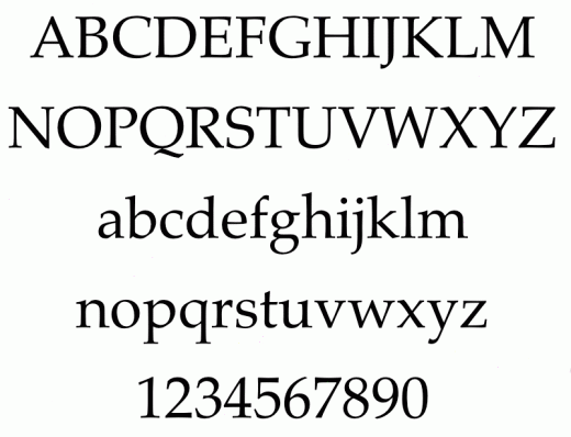
When you look at the printed page you see type with the letters of that type being shaped and proportioned to reflect the design qualities of that specific typeface. A typeface is defined as a collection of characters that are all designed to work together like the parts of a coordinated outfit:
Anatomy of Type
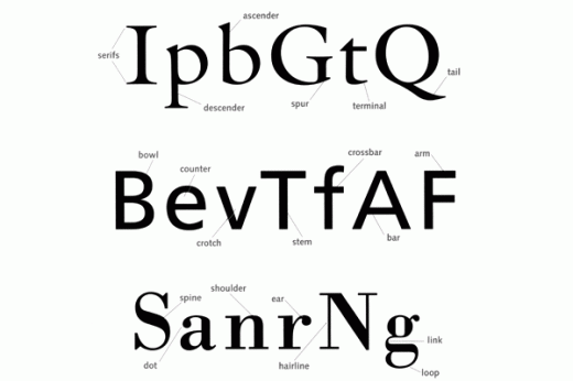
The Anatomy of type has long been defined by chiseled, handwritten and calligraphic letters, and the words we use to describe them are taken from both traditional and progressive typography:
Ascenders: the strokes of lowercase letters that rise above the mean line
Descenders: the strokes of lowercase letters that extend below the baseline
The heights and depths of ascenders and descenders vary widely from face to face with ascenders being quite a bit taller than the capital letters of that typeface but are usually constrained by the dimensions of the em-square of the typeface.
Serifs: the finishing flourishes at the ends of a characters main strokes where the stoke appears to flare out and are grouped into a category of seriffed typefaces. Serifs are not alone just for decoration, as they also aid in readability on the printed page by helping the eye distinguish one character from another.
Sans-Serifs: typefaces without serifs are grouped into a category called sans-serif typefaces; sans coming from the French word meaning “without.” San-serif typefaces are used more in display type environments first pioneered by the German designers at the Bauhaus School of Design between the two world wars wanting to strip down typefaces to their functional minimum.
Point Size
The measurements that you use every day are fixed or absolute measurements, meaning, an inch is an inch. Typography’s absolute measurements are picas and their subdivisions are called points.
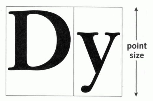
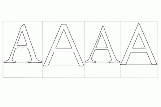
The modern point used in today’s standard is relatively new and was created by Adobe Systems in the course of developing the PostScript page description language.When fonts went digital the point size was defined as the height of the bounding box that surrounds each letter in the typeface:
When each letter was cast on its own block, point size was defined by the block itself:
- In 1883 the U.S. Type Founders Association came to the decision that a point should equal exactly .0138 of an inch or approximately 1/72 of an inch
- Adobe rounded the point measurement off to be exactly 1/72”
- A PostScript pica = 12 points which means that exactly 6 picas = 1”
Letter & Word Spacing
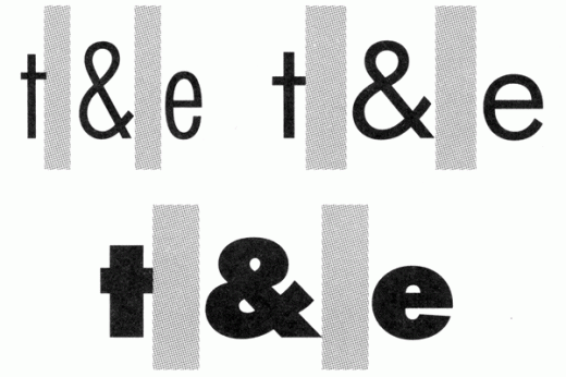
The spaces between letters are also measured in relative units to the size of the typeface.
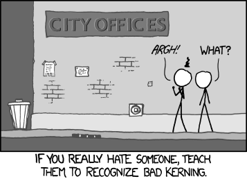
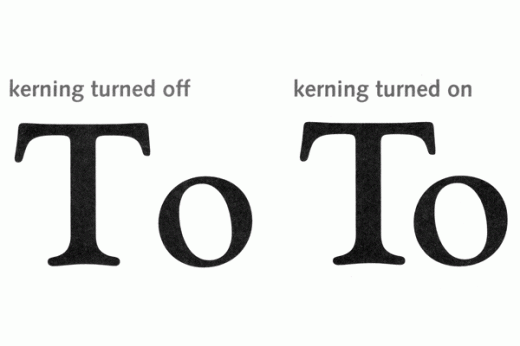
Kerning is the adjustment of space between letter pairs:
See Also:
- The Kerning Game | KernType
The width of a word-space is also defined as a fraction of an em with its width defined within each font because widths of characters vary from typeface to typeface:
The Baseline
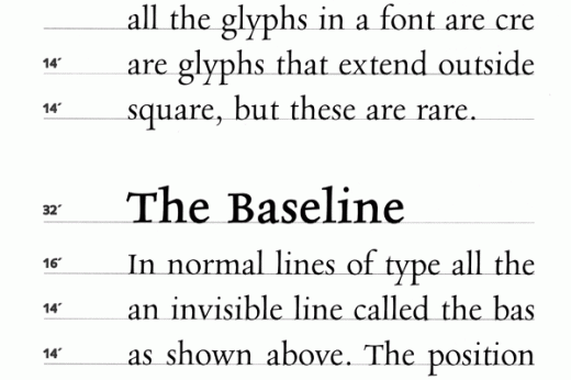
In normal lines of type, all of the letters sit on an invisible line called the baseline. Line-spacing, or leading, is the measurement in points from baseline to baseline between lines of type:
The position of the baseline within the em-square can vary from font to font depending on the design of the characters. On average, the baseline is located between one-third and one-fourth of the way up from the bottom of the em-square:
X-Height & the Mean, Mean Line
The impression of the size of a typeface is based mainly on the lower case letters defined by the distance from the baseline to the top of the lowercase x, is called the x-height. A line drawn at this height, parallel to the baseline is called the mean line of the typeface:
It is believed that typefaces with larger x-heights are easier to read
Weight & Families
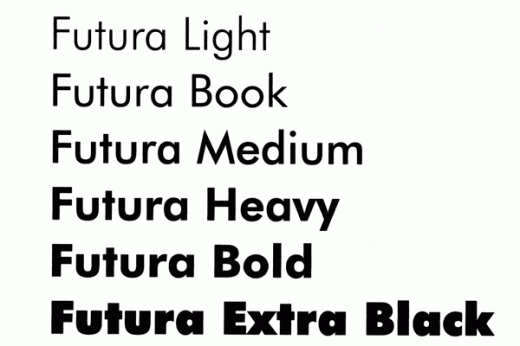
A major distinction between typefaces is held in the weight of those typefaces, meaning the thickness of the principal strokes of the letters. Depending on the thickness of these strokes, the typeface will be rated on a scale from light, book (regular), heavy, bold and black:
Romans, Italics & Obliques
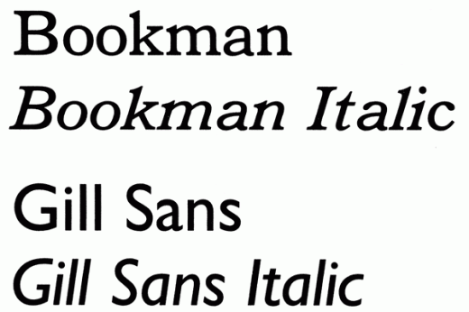
Many typefaces today have roman, italic and/or oblique versions of the typeface:
Romans: typefaces that have an upright structure and came out of the early days of movable type innovated in Rome that evolved into what we use for many text application today.
Italics: typefaces that came from a commercial printer who was looking for a way to conserve space on a page and mimicked the cursive style of handwriting to do this.
Obliques: typefaces are much like the cursive implementation, however they are merely just slanted forms of the roman typefaces.
This portion of the Premium Design Works website is written by Mike Sinkula for the Web Design & Development students at Seattle Central College and the Human Centered Design & Engineering students at the University of Washington.



8 Comments:
I found that cartoon really funny.
lol
The title of the site caught my attention as a communication design student, the problem I find is that there are only a few measurements of typeface, and that is not something I would condone as someone who is looking for research of an assignment. No offense.
You make absolutely no sense, Wonderboy.
An interesting presentation comparing Helvetica and Univers by a student.
http://sorayakramer.carbonmade.com/projects/28759#1
This is an amazing resource!! Thanks! (:
Here’s a fun exercise on kerning: http://type.method.ac/#
Trackbacks:
[…] M. Typography Anatomy and Measurements [online] Available from: http://www.sccc.premiumdw.com/web112/typographic-anatomy-measurements/ %5BAccessed 2 February 2013] Share this:TwitterFacebookLike this:Like Loading… Bookmark the […]