WEB112 » The Rules of Setting Readable Type
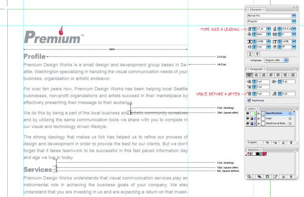
Readability is primarily the concern of the typographer or information designer. A reader should be assisted in navigating around the information with ease, by optimal inter-letter, inter-word and particularly inter-line spacing, coupled with appropriate line length and position on the page.
Download: Bio Page One | Premium Design Works
The rules of how to set type properly are relatively comprehensive, universal and a bit formulaic. By following the following rules, you will achieve readability in your copy design.
Readable Body Text
Body text (paragraphs) will make up the majority of your editorial content and should (first and foremost) follow the principals of readability.
Body text should:
- be kept to a line length of approximately 50-70 characters per line
- follow the 2/3 rule of ratio between type size and leading
- use appropriate space after each paragraph
Readable Headlines
Header text is used to denote sections within a written document.They are used to easily scan for appropriate information on the page.
See Also: How Pages are NOT Read | Premium Design Works
In order for headlines to function correctly, they should:
- add meaning for the visitor and strengthen your design
- create a sense of hierarchy
- be a bigger size than the body copy
- use appropriate space before and after
See Also:
- Typographic Contrast and Flow | Web Designer Wall
- Readability Lab Experiment | Arc90
- Typography Design for the Web | Premium Design Works
- http://www.hcde.premiumdw.com/about-us/faculty/
This portion of the Premium Design Works website is written by Mike Sinkula for the Web Design & Development students at Seattle Central College and the Human Centered Design & Engineering students at the University of Washington.


2 Comments:
http://www.comicsanscriminal.com/
For some “comic” relief..
See rule number nine: http://www.dynamicgraphics.com/dgm/Article/28512/
Trackbacks: