WEB200 » Typography Design for the Web
Typography is the art and technique of arranging type, type design, and modifying type glyphs. The arrangement of type involves the selection of typefaces, point size, line length, leading (line spacing), adjusting the spaces between groups of letters (tracking) and adjusting the space between pairs of letters (kerning).
Roles of Web Type
As you get to know the world of typography design for the web you will soon realize that the font you have always been in love with maybe inappropriate to use in certain instances. Yes, I am talking to you Papyrus lovers.
However, using a mixture of size, contrast and color in your web type will enable you to create a hierarchy, a sense of interest and an over all ergonomic look and feel to your page.
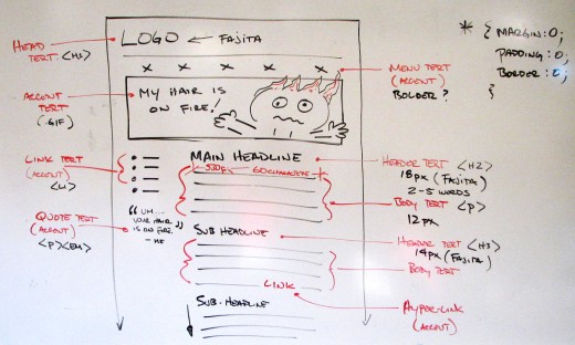
Generally speaking, your web page typography (text) can be broken into three main components:
1) Header Text
Header text is used to denote sections within a written document. The more significant the header, the stronger the visual presence should be. Giving your headers a bit of style will:
- add meaning for the visitor
- strengthen your design
- create a sense of hierarchy
Headers should be:
- a strong color from your palette
- limited to short lines of text
- a bigger size than the body copy
2) Body Text
Body text is the text that will make up the majority of your editorial content and should (first and foremost) follow the principals of readability.
Body text (paragraphs) should:
- be kept to a line length of approximately 66 (plus/minus 10) characters
- have plenty of contrast between the text and the background
- not use (odd) colors or underlines unless it is a link
3) Accent Text
Accent text is usually set apart from the main content that is being read. It is used to call attention away from the body text for a special purpose. It is generally text that is used in:
- sidebars
- navigation
- block-quotes
- captions
- spotlights
Accent text should:
- use shorter line lengths
- be limited to only a few lines
- not interrupt the flow of body text—rather it should enhance it
See Also:
- The Rules of Setting Readable Type | Premium Design Works
- Setting Type for the Web | Premium Design Works
Choosing a Typeface
OK… I have realized that I just should not use Papyrus anymore. So, what typeface do I use and why should I use it?
When considering a typeface, you should keep in mind the purpose that is it serving. Some factors in your decision may be:
- Brand: using a typeface consistent with the typeface of the logo and brand of the company
- Genre: using a typeface popular during a specific era or in a geographical location
- Readability: choosing a typeface in order for it to be easily read in a paragraph
- Emphasis: choosing a typeface for visual punctuation
- Display: using a typeface to express emotion
See Also: Choosing a Typeface | Premium Design Works
Putting it all together…
Lets take a look at some CSS Zen Garden examples:
Uh, oh… Limited Font Choices?
The most troubling aspect of using type on the web is that the list of usable fonts is both small and unpredictable.
See: Common Fonts for Windows & Mac | Web Design Tips & Tricks
Then See: Web Font Linking | Premium Design Works
This portion of the Premium Design Works website is written by Mike Sinkula for the Web Design & Development students at Seattle Central College and the Human Centered Design & Engineering students at the University of Washington.


13 Comments:
Great resource for helping you visualize your type scale (and it gives you the css):
http://type-scale.com/
Great resource for the Ideal line length in ems
http://www.maxdesign.com.au/2013/05/25/ideal-line-length-in-ems/
This was helpful:
http://www.noupe.com/design/a-crash-course-in-typography-the-basics-of-type.html
In class we were talking about 16/24 for type size and line height and the golden mean came up. Here are a couple of links on “divine” proportion and web design. http://www.vanseodesign.com/web-design/golden-section-proportions/
http://www.smashingmagazine.com/2008/05/29/applying-divine-proportion-to-web-design/
here’s an article on typography that applies to this week’s lecture: http://www.smashingmagazine.com/2012/05/02/applying-macrotypography-for-readable-web-page/
I’m a big ol’ @font-face and free creative commons fonts fan. These are the two sites I use most often for some pretty cool free fonts.
http://www.fontsquirrel.com
http://www.theleagueofmoveabletype.com/
word.
If you want to learn how to establish effective visual hierarchy, Carnegie Mellon has a short (free) online course in Visual Communication Design.
Average number of characters per line of text (including punctuation and spaces)=66
From: Robert Bringhurst, The Elements of Typographic Style
http://www.amazon.com/Elements-Typographic-Style-Robert-Bringhurst/dp/0881792063/ref=sr_1_1?ie=UTF8&qid=1297136723&sr=8-1
Surprising piece on type size and readability:
http://www.wilsonminer.com/posts/2008/oct/20/relative-readability/
I think this is the coolest. Rather then the user having to have your particular font installed to view it properly or making various pesky graphic images, use this site.
You can pick from 1000 fonts and simply embed their tiny snippet of code in you r page and voila! The user can read it as you intended regardless if they have that particular font installed.. Pretty cool i thought..
http://www.fontburner.com/
Mike,
Since you mentioned it in WEB 200 today, have some of your students check this out: http://www.helveticafilm.com/
Excellent film!!!
I found this great resource for some basics of typography (includes html solutions)
http://www.aisleone.net/2009/design/8-ways-to-improve-your-typography/
If you find yourself gathering fonts for use in your web designs (graphic text) check out this list of options:
(Some are free, others require purchase)
http://webdesignledger.com/freebies/40-super-sleek-fonts-for-clean-web-design
Trackbacks: