WEB200 » Building an HTML Template from Master Art
If you are like me, you love Adobe Illustrator. I use it to create my website wireframes, work on my visual design studies and create my master art.
This tutorial will walk you through how I build an HTML template from a master art file created in Adobe Illustrator:
View Code: https://github.com/msinkula/building-an-html-template-from-master-art
Download Code: https://github.com/msinkula/building-an-html-template-from-master-art/archive/master.zip
Step One: Exporting from Illustrator to Photoshop
Once I have my master art finished, I will need to export this document into PhotoShop where I can slice and optimize my graphics to use in my HTML templates.
Download: Visual Design Document | Premium Design Works
Note: You will want to make all of your layers in Illustrator “visible” before you export.
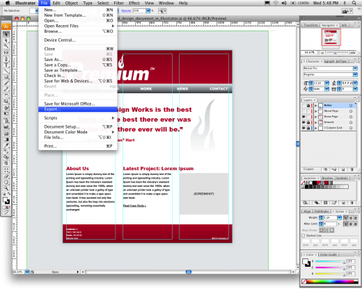
To export your master art from Illustrator to PhotoShop select File > Export:
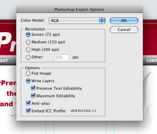
I typically choose Screen (72ppi) and Write Layers from the Photoshop Export Options:
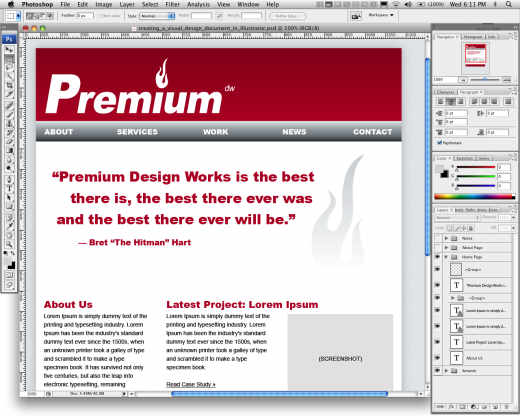
You will then have a nice Photoshop file to work from.
Step Two: Slicing and Optimizing Graphics in Photoshop
The first thing you will need to do is open the Photoshop file you just exported:
Notice that all of my layers are there… YEE-HAW!
Now I need to figure out which graphics that I will need to slice and optimize:
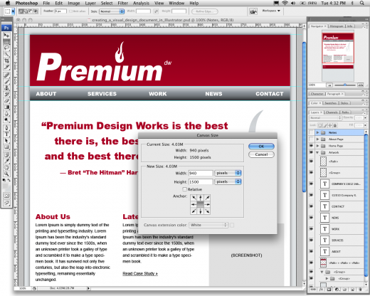
I will then need to trim my canvas size down to 940px wide and create some guides in my Photoshop document that I will use when slicing out my necessary images:
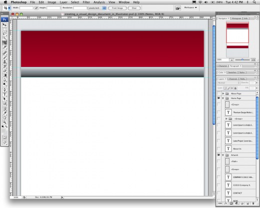
In order to get clean background files, I will need to turn off some of the unnecessary layers:
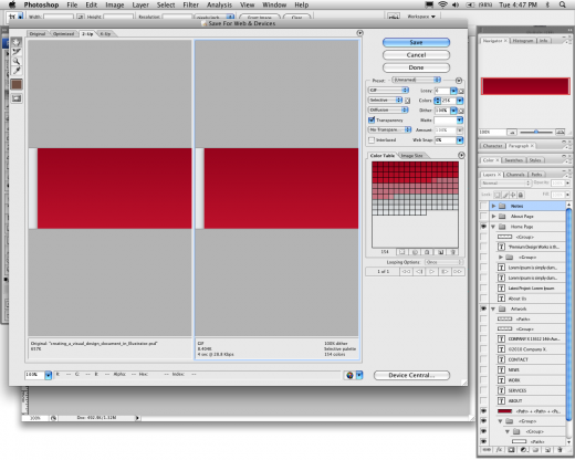
I can then slice out each piece I need and save them for web. Typically for background images I will “save for web” using a 256 color GIF file:
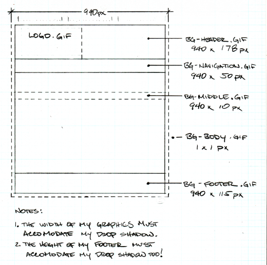
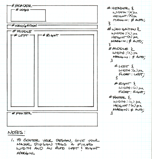
According to my planning sketch, I will need five background files:
Example Sites:
See Also:
- Basic Web Page Background Techniques with CSS | Line25
- How to Convert a Photoshop Mockup to XHTML/CSS | Line25
Now that I have my background, it is time to start building my template.
Step Three: Building the Basic Structure
I typically use the same template structure for just about every web project I do:
Here you can see my basic XHTML structure:
1 2 3 4 5 6 7 8 9 10 11 12 13 14 15 16 17 18 19 20 21 22 23 24 25 26 27 28 29 30 31 32 33 34 35 36 37 38 39 40 41 42 43 44 45 46 47 48 49 50 51 52 53 54 55 56 57 58 |
<!-- Begin Header -->
<div id="header">
<h1 id="logo"><a href="#"><img src="images/logo.gif" alt="" /></a></h1>
</div>
<!-- End Header -->
<!-- Begin Navigation -->
<div id="navigation">
<ul>
<li><a href="#">X</a></li>
<li><a href="#">X</a></li>
<li><a href="#">X</a></li>
<li><a href="#">X</a></li>
<li><a href="#">X</a></li>
</ul>
</div>
<!-- End Navigation -->
<!-- Begin Middle -->
<div id="middle">
<!-- Begin Left -->
<div id="left">
<ul>
<li><a href="#">X</a></li>
<li><a href="#">X</a></li>
<li><a href="#">X</a></li>
<li><a href="#">X</a></li>
<li><a href="#">X</a></li>
</ul>
</div>
<!-- End Left -->
<!-- Begin Right -->
<div id="right">
<h2>X</h2>
<p>X</p>
<h3>X</h3>
<p>X</p>
<h3>X</h3>
<p>X</p>
<h3>X</h3>
<p>X</p>
</div>
<!-- End Right -->
<!-- Begin Clear -->
<div> </div>
<!-- End Clear -->
</div>
<!-- End Middle -->
<!-- Begin Footer -->
<div id="footer">
<p><small>X</small></p>
</div>
<!-- End Footer -->
|
And the CSS presentation that goes with it:
1 2 3 4 5 6 7 8 9 10 11 12 13 14 15 16 17 18 19 20 21 22 23 24 25 26 27 28 29 30 31 32 33 34 35 36 37 38 39 40 41 42 43 44 45 46 47 48 49 50 51 52 53 54 55 56 57 58 59 60 61 62 63 64 65 66 67 68 69 70 71 72 73 74 75 76 77 78 79 80 81 82 83 84 85 86 87 88 89 90 91 92 93 94 95 96 97 98 99 100 101 102 103 104 105 106 107 108 109 110 111 112 113 114 115 116 117 118 119 120 121 122 123 124 125 126 127 128 129 130 131 132 133 134 135 136 137 138 139 140 141 142 143 144 145 146 147 148 149 150 151 152 153 154 155 |
* { margin: 0; padding: 0; border: 0;}
body {

background-image: url(images/bg-body.gif);

background-color: #2d2c7b;

}
h2 {

font-family: Verdana, Arial, Helvetica, sans-serif;

font-size: 21px;

line-height: 32px;

margin-bottom: 4px;

}
h3 {

font-family: Verdana, Arial, Helvetica, sans-serif;

font-size: 18px;

line-height: 26px;

margin-bottom: 4px;

}
p {

font-family: Arial, Helvetica, sans-serif;

font-size: 14px;

line-height: 21px;

margin-bottom: 7px;

}
p a {

color: #000;

text-decoration: underline;

}
p a:hover {

color: #000;

text-decoration: none;

}
li {

font-family: Arial, Helvetica, sans-serif;

font-size: 14px;

line-height: 21px;

margin-bottom: 7px;

}
li a {

color: #000;

text-decoration: underline;

}
li a:hover {

color: #000;

text-decoration: none;

}
#header {

width: 940px;

height: 178px;

margin: 0px auto;

background-image: url(images/bg-header.gif);

}
#navigation {

width: 940px;

height: 50px;

margin: 0px auto;

background-image: url(images/bg-navigation.gif);

}
#navigation li {

list-style-type: none;

display: inline;

}
#middle {

width: 940px;

margin: 0 auto;

background-image: url(images/bg-middle.gif);

}
#left {

width: 240px;

float: left;

}
#right {

width: 580px;

float: right;

}
.clear {

clear: both;

height: 0;

}
#footer {

width: 940px;

height: 115px;

margin: 0 auto;

background-image:url(images/bg-footer.gif);

}
#footer p {

padding: 20px 25px;

}
|
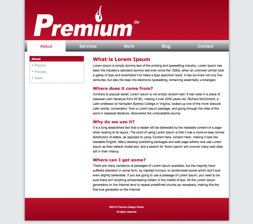
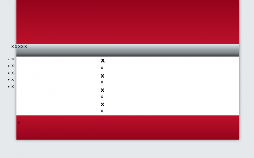
If I were to preview my work so far, I would see the basics in place:
Step Four: Placing, Formatting & Styling the Content
Now that I have my basic structure built, I need to start placing, formatting and styling my content.
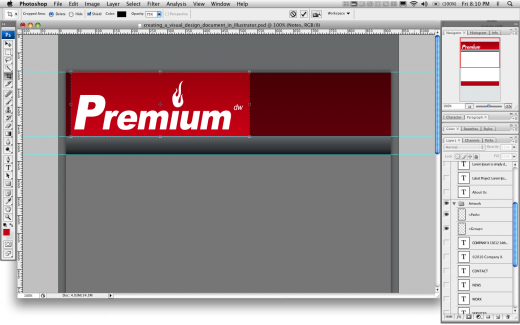
I will start off by placing the logo into my template. So, I will need to go back to my master Photoshop file to get it:
I will then need to crop and save for web. Once I do that, I will then add it to my template’s code:
1 2 3 4 5 |
<!-- Begin Header -->
<div id="header">
<h1 id="logo"><a href="#"><img src="images/logo.gif" alt="Premium Design Works" /></a></h1>
</div>
<!-- End Header -->
|
Let’s notice that I have used identification and alternate text attributes. I have also used some “Make My Logo Bigger Cream.”
Next, I will place some dummy text into the right division tag:
1 2 3 4 5 6 7 8 9 10 11 12 |
<!-- Begin Right -->
<div id="right">
<h2>What is Lorem Ipsum</h2>
<p>Lorem Ipsum is simply dummy text of the printing and typesetting industry. Lorem Ipsum has been the industry's standard dummy text ever since the 1500s, when an unknown printer took a galley of type and scrambled it to make a type specimen book. It has survived not only five centuries, but also the leap into electronic typesetting, remaining essentially unchanged.</p>
<h3>Where does it come from?</h3>
<p>Contrary to popular belief, Lorem Ipsum is not simply random text. It has roots in a piece of classical Latin literature from 45 BC, making it over 2000 years old. Richard McClintock, a Latin professor at Hampden-Sydney College in Virginia, looked up one of the more obscure Latin words, consectetur, from a Lorem Ipsum passage, and going through the cites of the word in classical literature, discovered the undoubtable source.</p>
<h3>Why do we use it?</h3>
<p>It is a long established fact that a reader will be distracted by the readable content of a page when looking at its layout. The point of using Lorem Ipsum is that it has a more-or-less normal distribution of letters, as opposed to using 'Content here, content here', making it look like readable English. Many desktop publishing packages and web page editors now use Lorem Ipsum as their default model text, and a search for 'lorem ipsum' will uncover many web sites still in their infancy.</p>
<h3>Where can I get some?</h3>
<p>There are many variations of passages of Lorem Ipsum available, but the majority have suffered alteration in some form, by injected humour, or randomised words which don't look even slightly believable. If you are going to use a passage of Lorem Ipsum, you need to be sure there isn't anything embarrassing hidden in the middle of text. All the Lorem Ipsum generators on the Internet tend to repeat predefined chunks as necessary, making this the first true generator on the Internet.
</div>
<!-- End Right -->
|
I’ve gotten this dummy text from: http://www.lipsum.com/
I will also need to update some of my styles to change my headlines to red and make sure there is a balance of spacing between headlines and paragraphs:
1 2 3 4 5 6 7 8 9 10 11 12 13 14 15 16 17 18 19 20 21 |
h2 {
font-family: Verdana, Arial, Helvetica, sans-serif;
font-size: 21px;
color: #bb102a;
margin-bottom: 4px;
}

h3 {
font-family: Verdana, Arial, Helvetica, sans-serif;
font-size: 18px;
color: #bb102a;
padding-top: 8px;
margin-bottom: 4px;
}

p {
font-family: Arial, Helvetica, sans-serif;
font-size: 14px;
line-height: 21px;
margin-bottom: 7px;
}
|
I will also need to reformat my right division tag to position it properly:
1 2 3 4 5 6 |
#right {
width: 580px;
float: right;
padding-right: 40px;
padding-top: 20px;
}
|
So far, so good:
But, I still have a lot to do. Let’s work on the menus now.
In this case I am going to add some standard main navigation items and give my navigation an identification:
1 2 3 4 5 6 7 8 9 10 11 |
<!-- Begin Navigation -->
<div id="navigation">
<ul id="navigation-items">
<li><a href="#">About</a></li>
<li><a href="#">Services</a></li>
<li><a href="#">Work</a></li>
<li><a href="#">Blog</a></li>
<li><a href="#">Content</a></li>
</ul>
</div>
<!-- End Navigation -->
|
I also need to add some new CSS formatting:
1 2 3 4 5 6 7 8 9 10 11 12 13 14 15 16 17 18 19 20 21 22 23 |
#navigation-items {
text-align: center;
}

#navigation-items li {
font-family: Verdana, Arial, Helvetica, sans-serif;
font-size: 18px;
color: #FFFFFF;
list-style-type: none;
display: inline-block;
}

#navigation-items li a {
color: #FFFFFF;
padding: 15px 50px;
display: block;
}

#navigation-items li a:hover {
color: #bb102a;
padding: 13px 58px;
background-color:#FFFFFF;
}
|
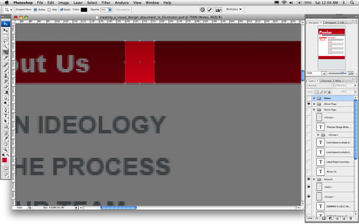
To complete the sub navigation, I need to go back to my Photoshop file and slice and optimize another couple of images. I need a background image for the sub navigation’s headline:
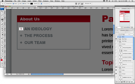
And a background image for the sub navigation’s list items:
I can then add the new XHTML content to the sub navigation and give it some identifications:
1 2 3 4 5 6 7 8 9 10 |
<!-- Begin Left -->
<div id="left">
<h2 id="sub-navigation-head">About</h2>
<ul id="sub-navigation-items">
<li><a href="#">Mission</a></li>
<li><a href="#">Process</a></li>
<li><a href="#">Team</a></li>
</ul>
</div>
<!-- End Left -->
|
And add the CSS formatting:
1 2 3 4 5 6 7 8 9 10 11 12 13 14 15 16 17 18 19 20 21 22 23 24 25 26 27 28 29 30 31 32 33 34 35 36 37 |
#sub-navigation-head {
height: 20px;
margin-bottom: 0px;
padding-top: 4px;
padding-left: 10px;
background-image: url(images/bg-sub-navigation-head.gif);
font-family: Verdana, Arial, Helvetica, sans-serif;
font-size: 12px;
color: #FFFFFF;
}

#sub-navigation-items {
border-right: 1px solid #949ca1;
border-bottom: 1px solid #949ca1;
border-left: 1px solid #949ca1;
padding: 5px 5px;
margin: 0px;
}

#sub-navigation-items li {
font-family: Verdana, Arial, Helvetica, sans-serif;
font-size: 14px;
color: #949ca1;
list-style-type: none;
padding-left: 16px;
background-image: url(images/bg-sub-navigation-list.gif);
background-repeat: no-repeat;
background-position: center left;
}

#sub-navigation-items li a {
color: #949ca1;
}

#sub-navigation-items li a:hover {
color: #bb102a;
}
|
Lastly, but certainly not leastly, I need to place the copyright text into my footer:
1 2 3 4 5 |
<!-- Begin Footer -->
<div id="footer">
<p><small>©2010 Premium Design Works.<br />All rights reserved.</small></p>
</div>
<!-- End Footer -->
|
Update the formatting:
1 2 3 4 |
#footer p {
color:#FFFFFF;
padding: 30px;
}
|
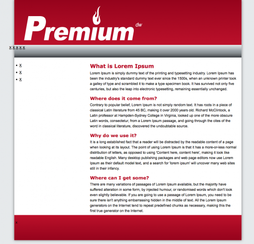
We now have our completed HTML Template built from our Master Art file:
View Code: https://github.com/msinkula/building-an-html-template-from-master-art
Download Code: https://github.com/msinkula/building-an-html-template-from-master-art/archive/master.zip
This portion of the Premium Design Works website is written by Mike Sinkula for the Web Design & Development students at Seattle Central College and the Human Centered Design & Engineering students at the University of Washington.


13 Comments:
Mine is done!
Home: http://www.lindese.com/web200/template/home.html
Events: http://www.lindese.com/web200/template/events.html
I can’t believe I didn’t submit this.. oops.
http://brownae.com/seattlecentral/web200/protosite/home.html
http://brownae.com/seattlecentral/web200/protosite/about.html
I thought this site was as useful as jigsawCSS validator, but different:
http://csslint.net/
Clearfix! (alternative to overflow:hidden or the clear div)…
http://nicolasgallagher.com/micro-clearfix-hack/
Thanks, Jake!
I just downloaded my own damn template to start a new project!
This really helps…like, a lot! thanks Mike.
This particular lecture is one that I have enjoyed the most. I would highly highly recommend that students enrolled in Web 200 NOT miss this lecture.
It really links together a lot of the design/coding pieces of the puzzle. If you already know these things it will still show you some valuable time saving shortcuts.
Here is a helpful link I stumbled across that mirrors alot of the tips/tricks from this lecture as well. The author does add some nifty JS stuff as well, but the basic slicing and coding is very helpful even sans the JS.
http://line25.com/tutorials/how-to-convert-a-photoshop-mockup-to-xhtml-css
Thanks for the mustache, Sean. “Can you hear me now? It’s me… Danny.”
priceless. For the record I think your doppelganger would whoop mine any time.
The class was great! I liked watching you actually build it from scratch.
I just hope that I can become as skilled!
Trackbacks:
[…] Also: Building an HTML Template from Master Art | WEB200 | Premium Design […]