WEB202 » Buying Your Product
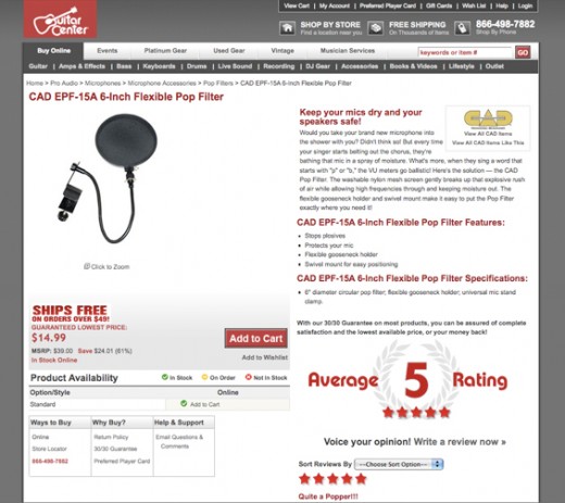
Hopefully we have enticed our consumer enough with the details of our product detail page via the Finding & Choosing Your Product lecture.
Let’s hope that they click the “Add to Cart” button:
If they do click the “Add to Cart” button, they are going to go through the shopping cart system. Therefore, our shopping cart interface needs to be an enjoyable user experience as well.
The Order Summary
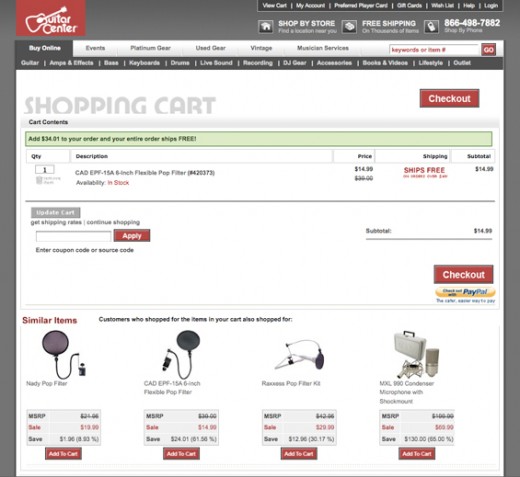
The first page that our consumer will land on is the “Order Summary” page that we laid out in our Interaction Design assignment:
Our task is to make ordering process as easy as possible while being clear on the details.
When the user gets to the “Order Summary” page, they should see:
- Photo: A photo of the product is a visual way of reassuring the user they have the correct product in their cart
- Quantity: Let the user choose how many they want to purchase or delete the item from their cart
- Description: A description of the product is a textual way of reassuring the user they have the correct product in their cart
- Price: Providing the price again will reassure the user that they can afford this piece of crap
- Shipping Fee: Letting the user know what the potential shipping fee will be will reassure them that they can afford to ship this piece of crap
- Sub-Total: Let the user know how much they are going to spend
Note: the screen-shot above fails to provide a photo of the product.
We also need to provide the user with the means to get to the next page. This is done (in this example) with a big obnoxious red “Checkout” button.
Sign-In or Register
Let’s hope that the consumer has reviewed their order summary and clicked on the “checkout” button to continue with their purchase.
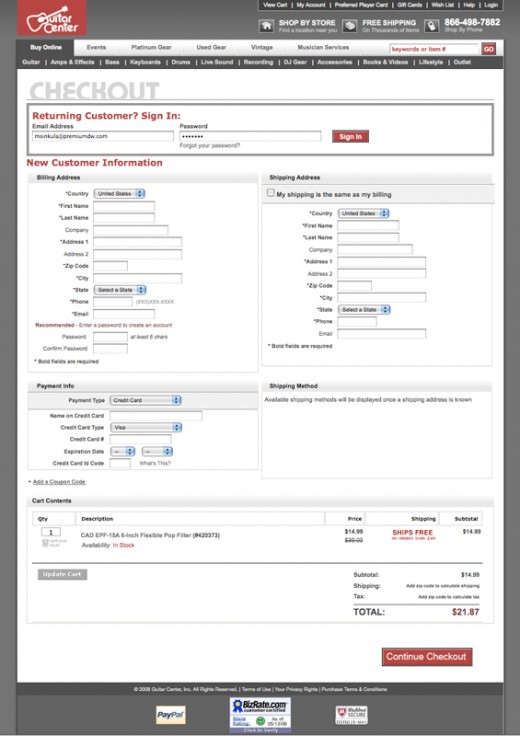
The next page that they should see is the “Sign-In or Register” page:
If this is a returning customer, they should be able to sign-in to access their account information via:
- eMail Address (UserName)
- Password
If they are a new customer, they are going to need to register a new account via:
- Billing Address
- Shipping Address
- Payment Info
- eMail Address (UserName)
- Password
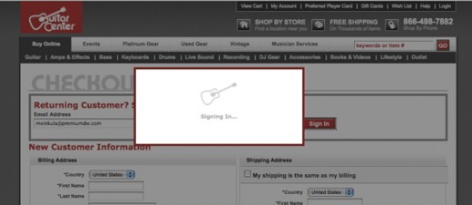
In this case, I am a returning customer. Therefore, when I type in my eMail Address (UserName) & Password to sign in, the website will need to verify my account information:
I am then shown my details once my account information has been verified:
It is important to show the user their account details because it is possible that their information has changed. I can also change my default shipping method if I need to.
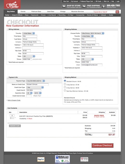
The website will then need to verify my credit card information to see if I can indeed afford this piece of junk:
Error Messaging
It is important to be clear anytime there is an error in the process or transaction.
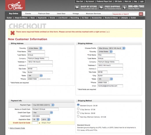
In this case I have forgotten to type in my Credit Card ID Code. Since I never remember to do so, I get an error message:
Error messages should be clear enough that I indeed know that I made an error in my process.
In this case, the obnoxious red “X” let’s me know that I made a mistake.
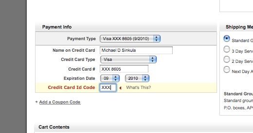
It should also be clear to point our where I made the error so that I can correct it effectively:
Note: I think GuitarCenter.com should make a point of highlighting the need to type in my Credit Card ID Code (like above) when I get to the “Account Details” page. This would reduce the amount of times I make this error.
After I correct my mistake, I will “Continue Checkout.”
Review & Place Order
This time my credit card has been validated successfully.
Anytime you are offering a purchasing system to your users, you will need to cut down on the amount of product returns and/or incorrectly shipped products.
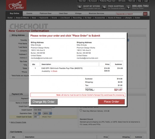
Therefore, lets “review” my order to double check that I am buying the correct needless product:
When the user gets to the “Reiview & Place Order” page they should see:
- Billing Address
- Shipping Address
- Product Quantity
- Product Description
- Product Price
- Sub-Total
- Shipping Cost
- Total Price
If everything looks correct to the user, they can then feel confident enough to “Place Order.”
Order Confirmation
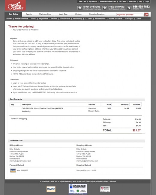
Lastly, we need to provide an order confirmation to the user.
The “Order Confirmation” page is the user’s receipt of payment:
The “Order Confirmation” page should contain:
- Order Number
- Billing Address
- Shipping Address
- Product Quantity
- Product Description
- Product Price
- Sub-Total
- Shipping Cost
- Shipping Method
- Tracking Number
- Total Price
- Thank You Message
This “Order Confirmation” should also be emailed to the user for reference.
Awesome! Only 5-7 business days until I get my thingy!
See Also:
- How to Make Your Shopping Cart Suck Less | The Oatmeal
This portion of the Premium Design Works website is written by Mike Sinkula for the Web Design & Development students at Seattle Central College and the Human Centered Design & Engineering students at the University of Washington.



1 Comment:
I am really grateful to the holder of this web page who has shared this great article at here.
Trackbacks: