WEB112 » Letter-Spacing & Color
When type is set on a page, it is said to have a certain visual texture created by the rhythms of the characters in lines and texture that is consistent. This visual texture is called “color” in the world of typography.
Using different Letter-Spacing will create a different “color.”
Tightly-Spaced: type will have a darker “color” and will tend to stand out on a page more than loosely-spaced type. Overly tightly-spaced letter pairs can/will interfere with the reader’s ability to recognize word forms of character patterns, particularly in sans-serif faces, that are usually easily read. They will become confusing and unfamiliar (an rn may look like an m, etc.) slowing the reader down and possibly annoying them by doing so.
Loosely-Spaced: type will have a lighter “color.” Overly loosely-spaced letter pairs can achieve the consistency of lighter type color but may also slow the reader down and possibly just loose them. Overly spaced letter pairs are not conducive to readability as it will be harder to make out the words that are being read.
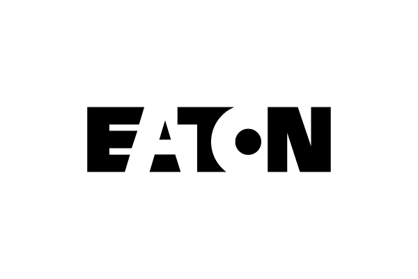
However, using different letter-spacing can also be an effective technique in logo design:


This portion of the Premium Design Works website is written by Mike Sinkula for the Web Design & Development students at Seattle Central College and the Human Centered Design & Engineering students at the University of Washington.


3 Comments:
A simple illustration of letter spacing and its effect.
http://designcreatives.blogspot.com/2010/01/universe-vs-helvetica.html
You must really, really hate us :P
http://xkcd.com/1015/
You are now as crazy as me.
Trackbacks: