WEB200 » Information Architecture for the Web
Information Architecture is the art of expressing a model or concept of information used in activities that require explicit details of complex systems.
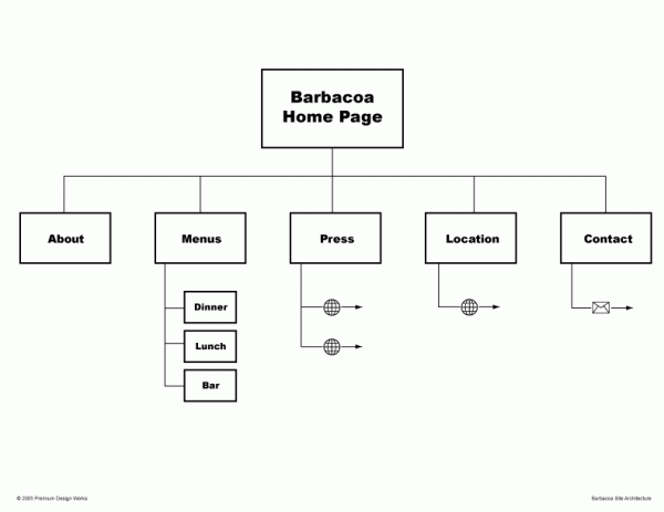
An Information Architect then, is the individual who creates the structure or map of information which allows the user find the information they want. They are responsible for structuring content and presenting their structures, patterns and relationships to the user:
Download: Barbacoa Information Architecture | Premium Design Works
The How to of Information Architecture
The “How To” of Information Architecture comes down to the ability to organize and present information into a usable format.
There are three main components of Information Architecture that we as website designers must master:
1) Meaningful Groups
Groups should correspond to how the user thinks about the subject matter. These groups should be broken down into standard categories and subcategories—main navigational links and sub-navigational links.
2) Functional Sequence
The goal of organizing a website hierarchy is to devise a sequence that best suits the users’ needs. Pages may be sequenced in order of importance or chronological order.
3) Naming Conventions
Names of your pages should be “generally specific”—meaning the names should be concise, yet broad enough to be meaningful to the user.
See Also:
- Complete Beginner’s Guide to Information Architecture | UX Booth
- Guide to Creating Website Information Architecture and Content | Princeton University
- Usability Card Sorting for Website | Intellavia
- Card Sorting the Human Centered Design & Engineering Website Information Architecture | Mike Sinkula
- Avoid Category Names That Suck | Nielsen Norman Group
- Flat vs. Deep Website Hierarchies | Jakob Nielsen
So… What does the User Want to Know?
When starting out with an architecture we need to ask… “What do our users want to know?” about this business, organization or artist:
- Who are you guys?
- What do you offer?
- Why should I chose you?
- Where are you located?
- When is this happening?
- How do I get a hold of you?
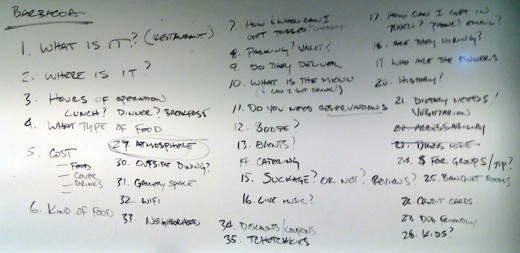
Let’s take a look at some sample questions that may influence whether someone would visit this restaurant:
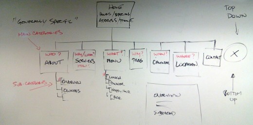
Once we figure out what our users want to know, we then need to create an architecture document that will lead them to the answer of their question by grouping these topics into categories and subcategories that will become our navigation scheme:
If the user can find the answer to their question on the website, they will be more likely to buy the business’s products or services.
This portion of the Premium Design Works website is written by Mike Sinkula for the Web Design & Development students at Seattle Central College and the Human Centered Design & Engineering students at the University of Washington.


9 Comments:
Some interesting tools and freebies.
http://www.webdesignerdepot.com/2017/01/whats-new-for-designers-january-2017/
Resourceful book find: Universal Methods of Design, 100 Ways to Research Complex Problems, Develop Innovative Ideas, and Design Effective Solutions by Bella Martin & Bruce Hanington, publisher Rockport. See Research Method 46 Heuristic Evaluation – relates to Web 200 lecture, MON 1/8/13 7P
Mike briefly discussed Card Sorting in his lecture on Monday. In case you would like to learn more about Card Sorting, I put together a resource of links that you might find useful.
If its on the front page, make sure its a good picture.
It should be professionally lit, well composed, and sharp.
If it doesn’t look appetizing, or informative as to what the food dish actually is, it will bring down the whole feel of the site.
The subject came up in class, that some of these “questions” we brainstormed may be answered on the website through non-textual means like images and color schemes. I want to propose that all restaurant websites should have at least one photograph of the type of food that they serve on the main page. It conveys so much information (and answers so many questions) without having to use words, besides looking professional and appetizing. Just a thought.
Good thought.
Trackbacks:
[…] scheme of a website which allows the user to find the information that they are looking for. The “How To” of Information Architecture comes down to the ability to organize and present information into a usable format via: 1) creating […]
[…] Also: Information Architecture for the Web | WEB200 | Premium Design […]
[…] conducting a panel discussion of “What do you want to know?” about a restaurant, we may find out a few things that do not necessarily coincide with what […]