WEB112 » Choosing a Typeface
Choosing a typeface is more than just an aesthetic decision, as it is also a decision based on how the reader views the information that is being presented.
Readability
We know that some typefaces are easier to read than others in certain applications. There have been many a study on readability issues over the years that have come to teach us what typographic practices enhance readability and which ones do the best jobs in their respective applications.
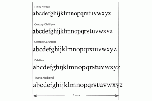
The standard typefaces for body text has been proven to be a Roman Serif typeface like Times designed for the Times of London as it has narrow character widths that aid in readability:
Emphasis
The traditional and easy way of expressing emphasis is to use a bold typeface in the midst of a regular typeface creating the effect of visual-punctuation.
Variations in size of the typeface, like making a headline bigger than the body copy, is also a way of expressing emphasis as this lends to a hierarchical-order of information.
Italic typefaces have commonly been used in the role of creating distinction such as in: book titles, names of works of art, definitions, etc.
Display
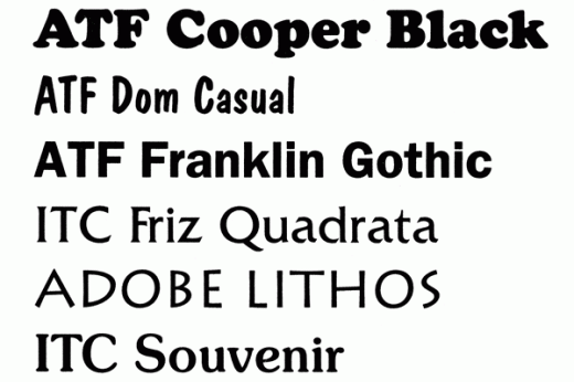
Display typefaces tend to be bolder and more evocative than body copy text typefaces:
Display typefaces often use what are called small-caps instead of upper & lowercase. Text typefaces as Times do not traditionally fare well in display applications as their role in readability in small sizes does not translate well when enlarged.
Decoration
Decorative typefaces are usually used for the purpose of advertising and has the job of grabbing the readers attention before they look elsewhere.
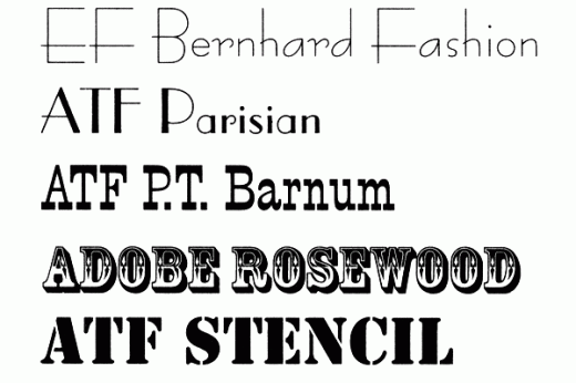
Most decorative typefaces tend to be more quirky and exaggerated than the display typeface and often go in and out of style very quickly. Once they become popular they tend to not stand out in the crowd any longer.
Many decorative typefaces are also designed for a different genre, which can create an illusion of an historical epoch, style, trend, cultural trait and usually link a message with its content:
Many decorative typefaces have little or no kerning information built into their typeface, so the designer must carefully work with the balance of the typeface in applications
Color & Contrast
Most typefaces were designed for black ink on white paper. So, shapes, proportions and stroke weights of their characters assume a high contrast between letter and background. When using typefaces in color on backgrounds that do not contrast as much, the typeface will need to become somewhat larger and/or bolder to communicate effectively.
Sans-seriffed typefaces work better in color because of their construction being much sturdier and their form being refined. It is easier to register a sans-seriffed typeface in four color process printing.
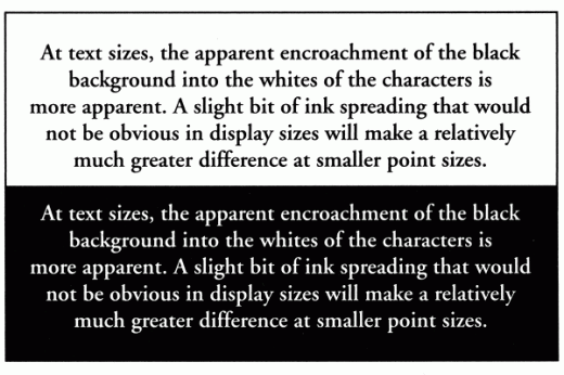
When reversing a typeface, white on black, the black background will visually encroach on the typeface making it seem thinner:
This portion of the Premium Design Works website is written by Mike Sinkula for the Web Design & Development students at Seattle Central College and the Human Centered Design & Engineering students at the University of Washington.


5 Comments:
Poor Comic Sans, it just can’t catch a break.
http://wanna-joke.com/if-fonts-were-dogs/
They psychology of font choice (and more)…
https://creativemarket.com/blog/2013/11/01/5-fascinating-font-infographics
its a comic sans comic sans comic sans world!
http://www.webdesignerdepot.com/2012/10/brands-from-a-parallel-comic-sans-dimension/
Here is a great site to see how many machines (among apple, windows, and linux), your chosen fonts exist. It many help you pick secondary fonts if your fonts don’t have good penetration and aren’t free fonts that you can throw on your server with a @font-face.
http://www.codestyle.org/css/font-family/sampler-CombinedResultsFull.shtml
Here’s a great article on free fonts for design work. There are links at the bottom for some more good font articles.
http://www.smashingmagazine.com/2009/06/05/beautiful-high-quality-free-fonts-for-your-designs/
Trevor
Trackbacks: