WEB200 » Content Layout for the Web
“Without good, relevant and organized content, everything on your website will merely be a placeholder.”
— Web Redesign: Workflow that Works 2.0, by Kelly Gato & Emily Cotler
Where’s My Content?
Yes… this is a question that you will be asking your Clients. But, this is also a question that you should be asking yourself when you are beginning the layout stage of your website project.
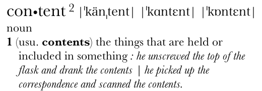
Dictionary Version 2.0.3 (51.5) by Apple Inc.
In my opinion, website design is largely if not all about the organization and presentation of content. Therefore, a considerable amount of time needs to go into designing the content layout of the website before the visual design stage should begin.
Arranging Content into a Meaningful Order
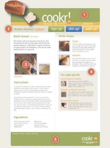
Pulling your elements together into a logical order is a must. Most website pages can be broken down into several basic elements:
- Branding
- Navigation
- Main Content
- Supplementary Content
- Site Information
See Also:
- 10 Rock Solid Website Layout Examples | Design Shack
- Essential Tips for Designing an Effective Homepage | SixRevisions
- Multi-Device Layout Patterns | LukeW
Traditional Wireframes
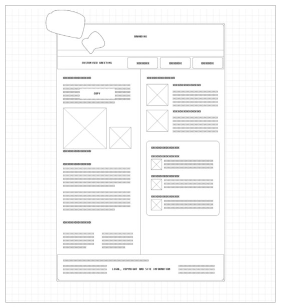
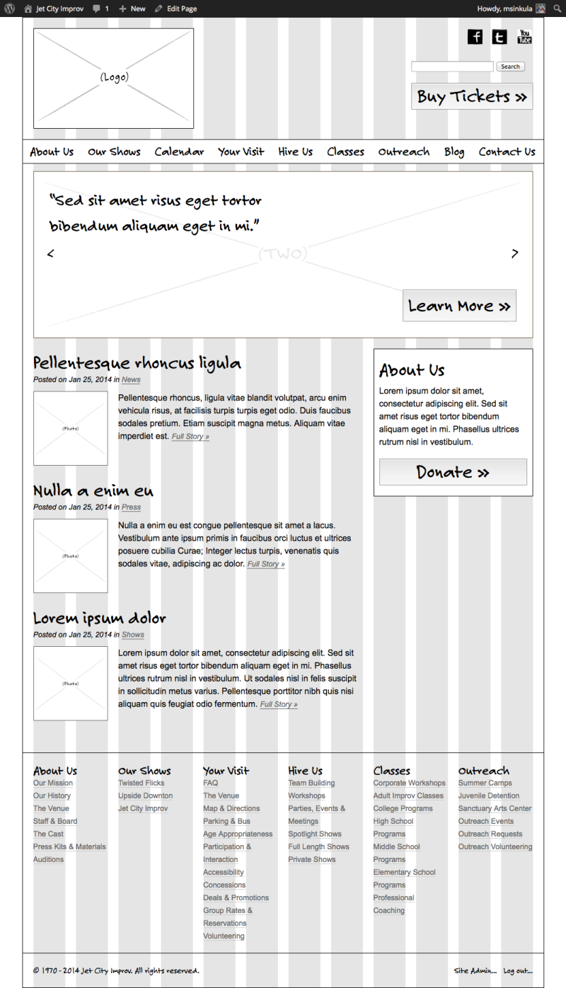
The process of designing the content layout of the website is done via Wireframes for each and every page. Traditional Wireframes are black-and-white diagrams that illustrate blocks of content, navigation and functionality of a website design.
Wireframes have been used as a tool to communicate content and structure of a page’s design without the distractions of color and imagery. They are also broadly understood by both Clients and Web Professionals. Wireframes are generally used to help a web designer work quickly through a series of layout iterations before the visual design is implemented:
See Also:
- Rehabilitation Institute of Washington Wireframes | Premium Design Works
- The Right Way to Wireframe | YouTube
- Quickstart on Prototyping with Wireframes | EightShapes
- 35 Excellent Wireframing Resources | Smashing Magazine
- Ultimate Guide to Website Wireframing | Six Revisions
- Wireframes for the HCDE Department Website | Mike Sinkula
- Wireframes for Jet City Improv | Premium Design Works
- 3 Illustrator Wireframes for Your Next Responsive Web Design Project | Matt D. Smith
Using the Grid
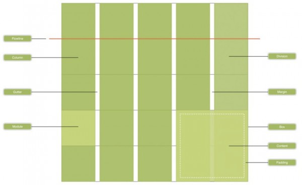
Grids are a combination of vertical columns, horizontal fields, and white space gutters. Designers have often thought that working inside a grid can be restrictive rather than a creative process. Untrue.
Using grids will:
- serve as a guide to designers to follow when placing objects on a page
- provide structure and add rhythm to a design
- will help a designer to create a composition that is easier for a user/reader to scan
- present information in a way that is more neatly organized and easier to follow
See Also:
- Grids: an invisible foundation | Ideabook
- A Brief Look at Grid-Based Layouts in Web Design | Six Revisions
- Grid and Column Designs | Web Designer Wall
- Fluid 960 Grid System | Design Influences
- 960px Grid System | 960.gs
- Templates and Sketch Books for Wireframing | GeekChix
- A new global visual language for the BBC’s digital services | BBC Internet Blog
- Illustrator 974px Grid System (12) | The Grid System
- The Simpler CSS Grid | Web Designer Wall
- 960px Column Grid Layouts | Portia Plante
- How to wireframe two web layouts in Illustrator using 960.gs | The Next Web
- Grids | Mozilla Developer Network
With my grid in place, I can start sketching out where I want all of my content to go:
Putting it All Together…
You: Great Mike… thanks for all of these screenshots and such from that book I cant afford! And… wow… don’t you look like a geek in that photo! But… what the hell do I do in order to turn in that Wireframes assignment?!?!
Me: Funny you should ask. I have an example we can look at. This should help put it into perspective for you:
View: Creating a Website Wireframe in Illustrator | Premium Design Works
This portion of the Premium Design Works website is written by Mike Sinkula for the Web Design & Development students at Seattle Central College and the Human Centered Design & Engineering students at the University of Washington.


10 Comments:
Great article by NN/g on Homepage Real Estate Allocation
http://www.nngroup.com/articles/homepage-real-estate-allocation/
Super rocking bookmark tool to download from 960.gs, I use the bookmark all the time.
http://peol.github.com/960gridder/
I just stumbled on this site and thought it might be a good resource for making mockups: http://balsamiq.com/ . I’ve been playing around with their web demo and it looks really fun and useful.
There a ton of great resources out there for grid layouts.
I find this one particularly helpful as you can add it to a page’s markup and then by pressing ‘G’, you can display it on your actual page to see how things are lining up.
I find it pretty helpful, hopefully your students will as well…
http://hashgrid.com/
Here’s a good article on using grid-based layouts. Also contains some good links to help you design your grids.
http://sixrevisions.com/web_design/a-brief-look-at-grid-based-layouts-in-web-design/
good grid resource.
http://www.thegridsystem.org/
IJ
Opppsss …
http://www.blueprintcss.org/
Here’s the link to the Blueprint website. Their tools are based on the Fluid 960 Grid System. It includes a number of CSS files to enhance the initial typography, etc.
It appears to be a free tool.
As anyone else tried it? Would like some feedback on whether it’s worth spending time trying it.
I don’t see the link?
Trackbacks:
[…] You can read the lectures here and here. […]