WEB112 » The Anatomy of Setting Type
Columns & Measures
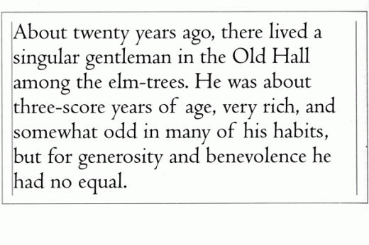
Type in print is usually set in a column and the width of that column is called its measure. The overall line length of a line of type may or may not reach out to the full width of the column’s measure, so these terms are not synonymous:
See Also: Readability – An Arc90 Lab Experiment
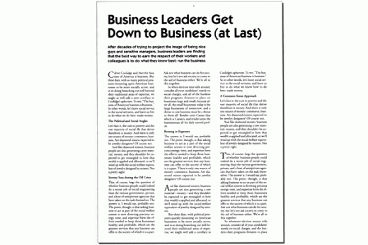
Defining a page’s number of columns and the gutter’s width between them is called a page grid:
See Also: Grids: an invisible foundation | Ideabook
Optimal line lengths often defined the typeface’s point size meaning that, it is optimal to have about 50-70 characters per line. So, you need to use the appropriate point size of type to achieve this balance:
Leading & Spaces
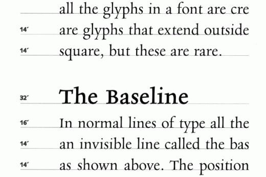
Leading is the distance of points from the baseline of one line of type to the baseline of the next line of type:
The name leading comes from the days of movable type when you literally needed to add lead to increase the distance between lines. Some word processing programs may refer to this as line spacing to avoid lead poisoning.
- Solid-Leading: is to say that the leading equals the point size of that type: “twelve on twelve”
- Negative-Leading: is to say that the leading is less than the point size of that type: “twelve on ten”
- Auto-Leading: which is roughly 1.2 times the value of the point size of its type—never leave your leading set to “auto”
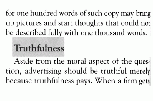
When using headlines and/or sub-headings that are a different type size than your body copy, it is typical to use “space-before” and “space-after” in the style definition for “headline:”
Hyphenation & Justification
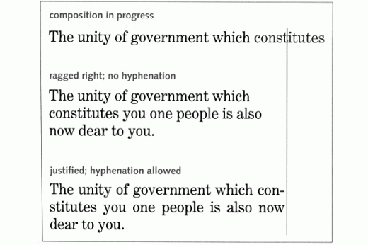
Justification is the process of filling lines of a given measure with type. Every line of type is justified either left, right, centered (with the remaining space filled out to the edge of the margins) or forced (where the space is distributed between the words on the line of text to push the text out to both left and right margins).
Hyphenation is the means of allowing words to be broken into fragments to better fill out the line of type to look appropriate:
You can set Hyphenation & Justification within the text editing or layout program for how you would like it to act: with or without hyphenation and justified either left (ragged-right), right, center or forced.
Word & Letter Space
In theory, when your measures or columns are wide enough, just about any type setting or word processing will be able to create evenly-spaced words (and good color) over the entire page, versus narrowly spaced measures and columns.
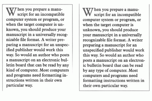
Allowing word spaces and hyphenation to be flexible by your program will allow for a tighter rag. This is easier to read in narrow measures and columns:
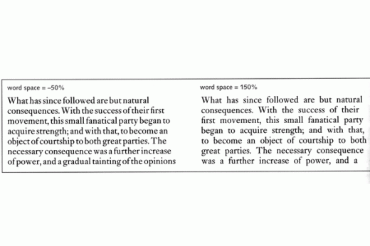
Overly tightly spaced words lend for poor readability much more than nice loosely spaced words:
Kerning & Tracking
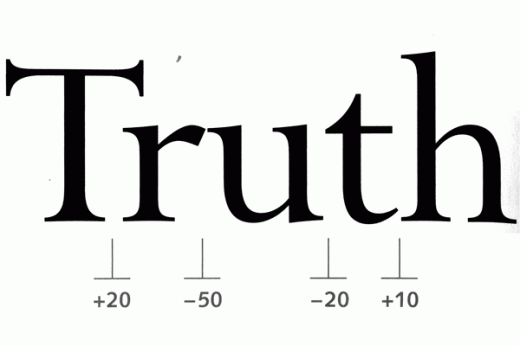
Kerning and tracking adjustments are calibrated in the same units, usually thousandths of an em, but are actually quite different. Kerning targets and adjusts the spaces between specific letter pairs:
Kerning is done automatically in most cases due to the built in kerning tables of the given font being used. However, not all fonts have kerning tables so kerning must be done by hand.
Tracking targets and adjusts the spacing between letters over the whole line of type and is frequently used to tighten or loosen the overall letter/word spacing of that line of text.
This portion of the Premium Design Works website is written by Mike Sinkula for the Web Design & Development students at Seattle Central College and the Human Centered Design & Engineering students at the University of Washington.


2 Comments:
.. just discovered this useful typesetting testing tool.
http://www.csstypeset.com/
12 tips and tools for making your web site typography better. Many good guides and tools to help with CSS. Check it out!
http://webdesignledger.com/resources/12-css-tools-and-tutorials-for-beautiful-web-typography
Trackbacks: