WEB200 » Color Theory for the Web
Trust me… If I wanted to go see the circus, I would. So… don’t let a clown design the color palette for your web page.
The more colors you add, the more chaotic a web page may become. Colors will also convey or not convey the branding of the company in your web page design.
The Influence of Color & Color Psychology
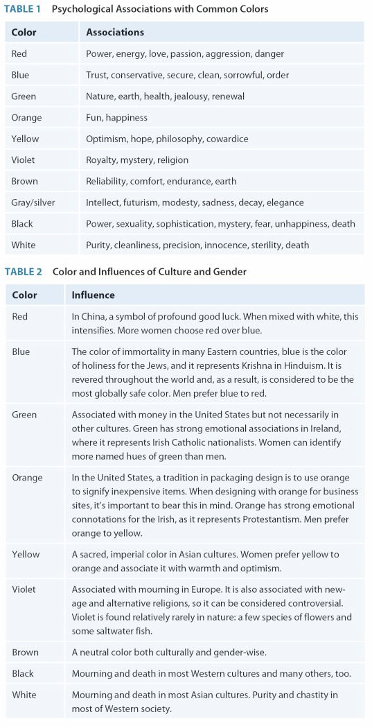
As a web designer seeking to offer a message to your audience, you will find that you will need to understand the psychological effects, cultural influence and gender issues associated with colors.
The appropriate use of color is a significant piece to visual communication. Color can be just as, if not more, persuasive to the human eye as imagery and text. Therefore, the colors you choose for your web page need to be appropriate to your overall message.
The influence of color on human emotion is a complex relationship involving numerous factors:
- Psychological effects
- Cultural influence
- Gender bias
See Also:
- 04 The Power of Color | HTML & WEB Artistry
- 02 Web Aesthetics | Designing Web Graphics
- Color Symbolism and Psychology | Wikipedia
- Color Psychology | InfoPlease
Choosing Your Colors
Each element of the page can have a different color specific to its function on the page. But, together they must be a cohesive family of colors.
1) Backgrounds
The background is the backdrop or canvas against which all of the content and information appears. It should make an impression on the viewers and relate to the story but not detract from the action on the stage.
2) Body Text & Headlines
Your text must be easy to read! Pick a color that reads well on the background you have chosen.
Most typefaces were designed for black ink on white paper. So, shapes, proportions and stroke weights of their characters must have a high contrast between letter and background. This serves to increase readability.
3) Navigation
The user should be aware of the navigation but not distracted; non-distracting color from the palette should be used.
Establishing rules for navigation via color will help overall consistency.
Basic Color Theory & Color Combinations
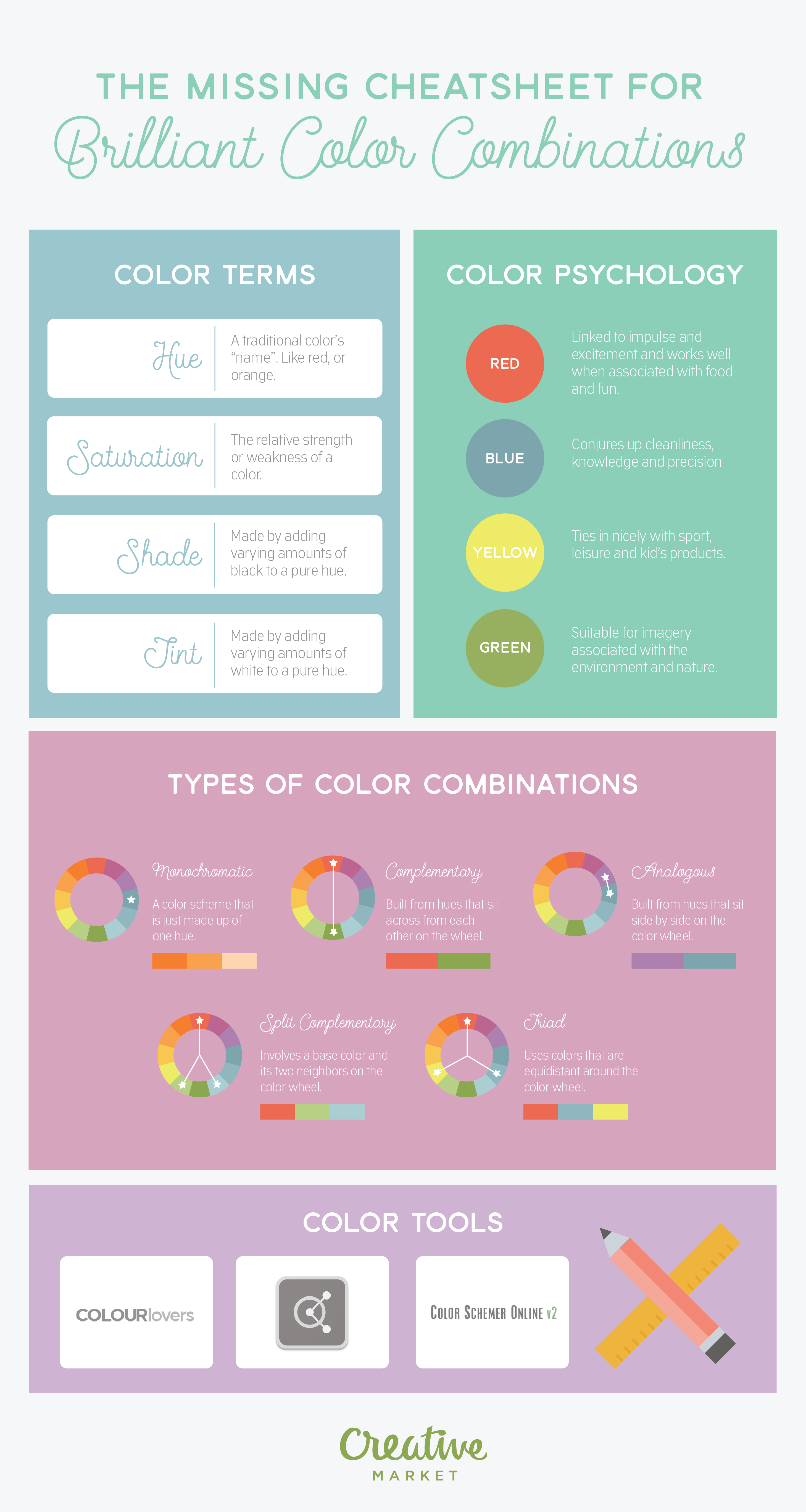
With colors you can set a mood, attract attention, or make a statement. You can use color to energize, or to cool down. By selecting the right color scheme, you can create an ambiance of elegance, warmth or tranquility, or you can convey an image of playful youthfulness. Color can be your most powerful design element if you learn to use it effectively.
See Also:
- Creating Consistently Colorful User Experiences | UX Booth
- The Missing Cheatsheet For Brilliant Color Combinations | Creative Market
- Basic Color Schemes: Color Theory Introduction | Tiger Color
Creating Color Palettes
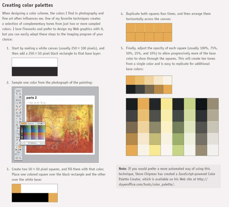
Creating a color palette from scratch can be difficult at best. I recommend using a pre-existing palette to start with.
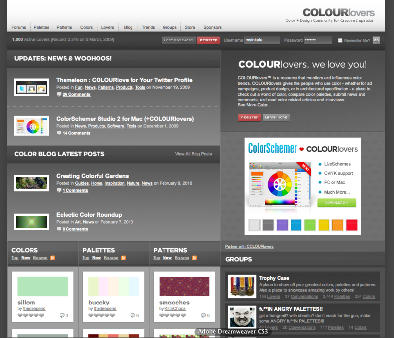
COLOURlovers™ is a resource that monitors and influences color trends. COLOURlovers gives the people who use color – whether for ad campaigns, product design, or in architectural specification – a place to check out a world of color, compare color palettes, submit news and comments, and read color related articles and interviews
See Also:
- Adobe Color Palettes | Kuler by Adobe.com
- Color Palette Creator v1.6.1 | SlayerOffice
Extending Your Color Palette with Tints & Shades
Once you have a color palette established, you can create tints & shades from the colors to expand the palette:
- Tint: the process of adding white to a color
- Shade: the process of adding black to a color
Starting with the branded color scheme and creating tints & tones will greatly expand your palette.
See Also:
- Creating Tints & Shades in Illustrator | Premium Design Works
- Seattle Central College Brand Guidelines | Seattle Central College
- Creating Color Palettes | Andy Clarke.
- Extended Color Palette | Premium Design Works
- RIW Extended Color Palette | Premium Design Works
- IT Department Website Color Scheme | Falconer Design Studio
- Simple Formulas for Calculating Tint and Shades | CodeMelon
- Color Palette Creator | Slayer Office
- HTML Color Picker | W3Schools
Putting it all together…
Let’s take a look at some examples:
This portion of the Premium Design Works website is written by Mike Sinkula for the Web Design & Development students at Seattle Central College and the Human Centered Design & Engineering students at the University of Washington.


28 Comments:
http://paletton.com
I have read so many articles concerning the blogger lovers however this piece of writing is truly a good article, keep it up.
I visited lots of website but I this one this one holds plenty of useful stuff.
The article posted was very enlightening as
well as practical. You people are doing an excellent job.
Keep posting.
My brother suggested I might like this blog. He used to be entirely right.
This publish truly made my day. You cann’t believe just how a lot time I had spent for this information! Thanks!
And while with chemicals, there is always the chance immunity can develop, diatomaceous earth kills through physical action.
is what people have been searching for vigorously on the internet and have been growing increasingly desperate to eliminate these
pestering creatures from their lives. Some of these places are infested with bacteria that can spread
diseases.
Pests are the most annoying part of the home since they are very difficult to separate from the house.
is what people have been searching for vigorously on the internet and have been growing
increasingly desperate to eliminate these pestering creatures from their lives.
all pests that can structurally damage homes and are often misidentified by
homeowners.
An benefit to this software is that it works flawlessly and rarely/never crashes.
There are times ladies want to ditch the purse and go dancing.
And in situation, your information get lost you can restore them by using iTunes.
Here is a nice site that names the 147 CSS colors that are available:
http://www.colors.commutercreative.com/
I’ve been surfing online more than 4 hours
today, yet I never found any interesting article like yours.
It is pretty worth enough for me. In my view, if all web owners and bloggers made good
content as you did, the net will be a lot more useful than ever before.
This not only gets you discounts on certain menus,
but will also get you away from all the crowd during peak times.
I couldn’t help but wonder if we caught anything on our
equipment. Spa – Terre is a true beach front boutique spa, promoting a combination of health, peace and relaxation in a tranquil, refreshing Florida spa resort
experience.
This paragraph gives clear idea in favor of the new viewers of blogging, that actually
how to do blogging.
Always take the time to read a number of sites to compare and contrast
ratings and watch for sponsored ratings which could be biased.
Only a few creams in the market feature such a formula.
When it accomplish added sense, however, if you took the time afore you go arcade for contraction chrism
to acquisition out what contraction creams and contraction chrism capacity absolutely work.
I just recently put in a steam shower unit,
finest thing we’ve purchased in a long while, the children and family like it so much, can not see
us heading back to conventional showers again
Had been in actual fact shopping for just an average shower enclosures during which I came across this
page, didn’t have any idea there was any such thing as a ‘steam shower enclosure’,
incredible, will probably just may have to get one
Hi Mike, I found two color resources that might be useful:
http://color.hailpixel.com/#
http://colorschemedesigner.com/
A nifty tool to find the closest pantone color to the hex or RGB value you have.
This is a really cool color site I use often.
Upload your photo and get your color pallet. http://www.colorhunter.com
http://www.urbandictionary.com/define.php?term=blammy
Check out Adobe’s Web site Kuler where you can explore, browse and create color themes.
Kuler can also be accessed from inside Illustrator CS5 (and other Adobe applications). Go to: Window > Extensions > Kuler
http://colorschemedesigner.com/
This is a really fun tool that allows you to export a palette to a photoshop file, text, css, etc.
Is this a good color palette? http://isu.indstate.edu/ilnprof/ENG451/ISLAND/
See top of page.
I thought this was a cool use of Flash. You don’t need Flash to completely design a site, but sprinkling it like stardust on certain elements can make a site unique. Check out this link:
http://www.creative-outsourcing.com/index-en.html
Trevor
My favorite stock image site is stock.xchng at http://www.sxc.hu/ . Their selection is really good and I’ve found a photo for just about anything. You can type in colors and get great images back.
Trevor
Spoonfed Photoshop Tutorials
http://psdtuts.com/category/tutorials/interface-tutorials/
Ton’s of great FREE photoshop tutorials. I was particularly interested in their interface tutorials.
This is my new favorite stock photography site!
http://www.photocase.com/en/
Photocase is a curated, user-driven stock photography library of high-resolution photography. Updated with new photos daily, our aim is to publish photos with style and character at an affordable price. We see Photocase as a place to go to get away from the clichéd classic stock style. All photos are uploaded by users, reviewed by our photo editors for quality and suitability, then the lucky ones are published online and may be purchased or downloaded and used for private or commercial projects by any registered member of Photocase (providing the use complies with our Terms of Use).
Trackbacks: