WEB112 » History of Typography
It has been said that, “Those who do not learn their history are doomed to repeat it.” In the case of typography, “Those who know the history of western typography will not want to repeat it.”
Movable Type & Johannes Gutenberg
Johannes Gutenberg’s system of movable type was based on the casting of each character on its own metal block. Every letter of the alphabet, every punctuation mark, and every numerical symbol was molded in high relief on its own metal block. The raised shapes of the letters then got inked and pressed onto the paper:
To set type using Gutenberg’s technique, the blocks cast from a lead alloy, were then arranged in rows to be printed on the page:

http://upload.wikimedia.org/wikipedia/commons/thumb/a/ae/Metal_movable_type.jpg/800px-Metal_movable_type.jpg
- Word spaces were created with shorter blocks that didn’t come up to the level at which the printing blocks were inked
- The “nick on the front of each block is an orientation aid, helping the hand typesetter to distinguish, for example between a “d” an upside-down “p”
- To be printed correctly, the images of characters were reversed and had to be set from right to left
- These rows of letter blocks – lines of type – were stacked one below the other to form a page and was locked in place by a frame that pressed in on all sides.
- Just as important as the printing blocks, were the non-printing blocks, whose job it was to secure the positions of the others
Even though this system of typesetting has long been automated and computerized, these initial concepts of letter blocks and spacing have remained in digital printing and typesetting.
In the days of handset type the term font, which came from the French word meaning casting or molding, comprised one or more drawers full of type blocks in a single size.
Bounding Boxes and Spaces
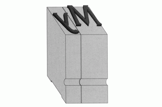
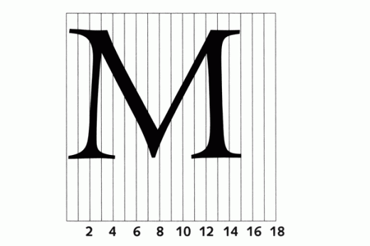
Within the computerized typesetting system, every character and symbol is conceived of as existing in a box whose dimensions are analogous the surface of these old metal printing blocks:
This bounding box defines the space each letter takes up on a printed page. The space between the character and the edge of the bounding box is called the side bearing which also defines how far the character’s image will be from the image of a character next to it.
Digital type, unlike metal type views these bounding boxes as being virtual boundaries and able to be manipulated and overlapped:
The new essence of typesetting is regulating the size of the spaces between letters, words and lines to control the balance and rhythm between black and white achieving a graphically harmonious page.
Type Design as a Function of Size
Gutenberg and the printers and typesetters that followed were obliged to follow type design, book design and calligraphic conventions that had already been in place. They felt that characters rendered in different sizes should be rendered proportionately.
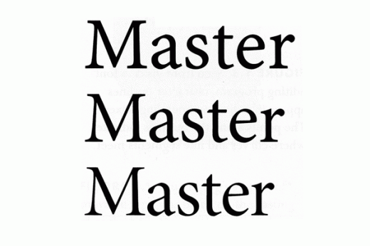
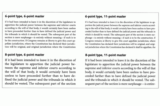
Type in small sizes (footers) is more legible if the characters are somewhat wider and heavier. In large sizes letters (headlines) corresponding to the same design can be more finely molded – thinner, lighter and more nuanced:
When all sizes of type were produced from a single master, small type usually became pinched looking and hard to read and large type looked bulky and heavy. As a result, wholly separate typesetting systems came to be used for different sizes of type:
At first there were no universal standards for the proportions or dimensions of the handset type blocks used to set type. Different foundries were responsible for designing their own type and often plagiarized.
Evolution & Automation
The typewriter was considered the first desktop publishing tool and started to incorporate several concepts that are key to modern typesetting systems:
The principle of escapement, where the paper moves from side to side and the printing element is stationary so that when a key is struck and the paper moves in position to receive the next letter – escapes – is still relevant today. After the character you type on the screen appears the cursor moves – escapes – to the right to receive the next character.
Mono-Spaced, Proportional & Lino Type
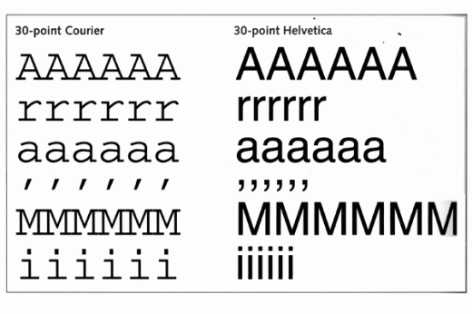
As the typewriter was developed it was impractical to design the typewriter to have a unique escapement. Allowing every character to have a unique width would make for a very precise but complicated machine. So, instead of adapting machine to the alphabet, the alphabet was adapted to the machine and monospaced type was born.
In mono-spaced type, all of the characters have the same width thereby having the same escapement:
The linotype machine, which appeared about the same time, used a similar counting system but instead assembled the molds for a line’s worth of characters. With the advent of Monotype and Linotype machines a “font” then became a set of molds from which type could be cast as it was needed.
The letters of the Latin alphabet have varying widths and diverse shapes making typography the complex practice that it is So, Inventors of early typesetting systems tried dividing the characters in a typeface into a fixed number of categories, sorted by width.
Every typeface had to be designed with a standard way of expressing the width of the characters called units:
Photographic Fonts
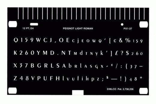
Early phototypesetting machines substituted small photographic negatives, instead of molds into which hot metal was poured for casting, to bear the images of the characters for printing:
This meant that, from a typesetting standpoint, type could be scaled to various sizes through a series of lenses. A range of type sizes could be generated from a single set of master “fonts.”
Electronic Fonts
Efforts to improve the scaling of photographic fonts in the 1950’s led to experiments with cathode ray tubes to sharpen the images of type. By 1960 a variety of typesetting machines appeared that could image type directly from a CRT onto photographic film by mathematical formulas creating electronic “fonts.”
In the early 1980’s a sudden series of technological changes revolutionized typesetting with the advent of desktop computers that had enough memory as those dedicated to running just typesetting systems. The desktop computer started using onscreen previews of your printed page which you could the print out via a desktop laser printer.
Adobe Systems created the device independent PostScript computer language to describe any printed event on the page to the laser printers by use of Page Description Languages (PDLS). Adobe soon became on of the leading PostScript Font developers. Unfortunately, the stock I used to have in Adobe in the ’90s would allow me to already be retired.
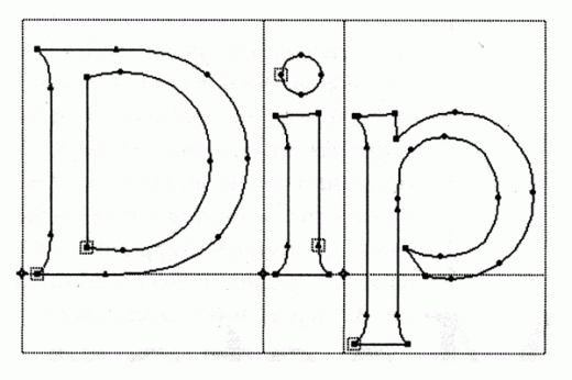
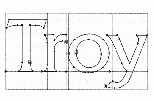
PostScript Fonts store the images of characters as outline drawings that can be manipulated via points and Bézier curves:
See Also: The Letter Shaping Game | Shape Type
This portion of the Premium Design Works website is written by Mike Sinkula for the Web Design & Development students at Seattle Central College and the Human Centered Design & Engineering students at the University of Washington.



6 Comments:
A pretty old post that I;ve discovered here by the looks of things, nevertheless as a web design company, it is fascinating to discover the history behind typography- very informative
A nice link for your Resources page of this class.
https://helpx.adobe.com/content/dam/help/en/illustrator/pdf/illustrator_cheat-sheet.pdf
I am taking this course currently (Fall, 2012). I remember watching this video quite a while ago and this class reminded me of it. It has some very interesting typography techniques and details the history of making usable typefaces for multiple forms of media. It also talks about the future of web fonts and their current stage.
http://www.aiga.org/video-pivot-2011-hoefler/
You’re going to LOVE this!
http://static.colourlovers.com/uploads/images/typographic_infographic.html
you might like this
http://stocklogos.com/topic/past-and-future-famous-logos
Nice site and syllabus. Nice explanations.
I have one small quibble. On this page, in the third bullet below the photo of handset type, you say, “To be printed correctly, the images of characters were reversed and had to be set from right to left.” But the photo shows that the type is set from left to right upside down, and from bottom to top. That’s how it’s done with lead type! I learned it back in the day. The habit of reading from left to right is so strong that it’s easier to read the letters upside down and mirrored if you read L-to-R. Reading from right to left with the letters the right side up, but still mirrored is much more unnatural and uncomfortable.
But again, my compliments on a very informative site. It took me about one minute to realize that I should bookmark it.
Trackbacks: