My Human Centered Design & Engineering Capstone Project
Posted on November 20th, 2013 in Case Studies
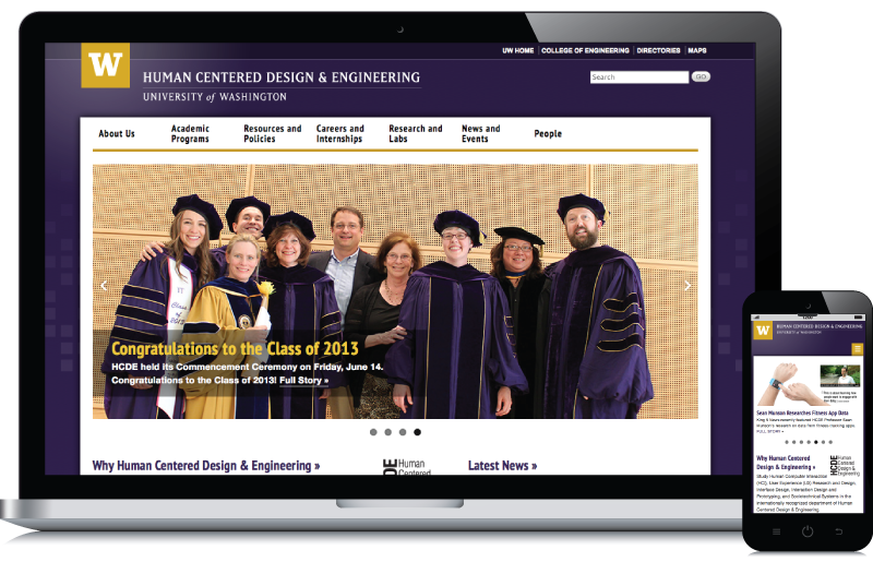
Website Information Architecture, Visual Design & Drupal Development for the Human Centered Design & Engineering (HCDE) Department at the University of Washington.
The Story
Many of you may know that I decided to go back to school and get my Master’s Degree in HCDE from the University of Washington. For those of you who didn’t know… let me tell you, it’s been a long, but interesting and fulfilling journey.
So, why did I want to go back to school and get a Master’s Degree? In short, it was just in my best interest to take my career to the next level. And, it didn’t take long for the department there to put me to some good use.
Since, I have been teaching Web Design & Development at Seattle Central Community College (SCCC) for quite some time now, the HCDE department put me to work teaching the Web Development labs for their User-Centered Web Design class. They have even asked me to turn the labs into it’s own Web Development Workshop for them now that I am done with the program.
The Project
To graduate the program, every student needs to take the Capstone Project class. This class is intended to highlight a student’s integration of knowledge and skills acquired during the program into one project. Therefore, I pitched the idea of redesigning the department’s website as my Capstone Project.
Once the project was approved, I worked closely with the department’s Communications Director on the phases of the project as described below.
Card Sorting Research for the Information Architecture
Unfortunately, I never got an opportunity to take the User-Centered Web Design class due to being the lab instructor. As a result, this left one major hole in my education called card sorting.
Card Sorting, as defined by Courage & Baxter (2005), is a popular and inexpensive user-centered research methodology that allows the researcher to collect data from website user groups in terms of how information on a website should be grouped, organized and labeled according to the user’s mental model.
Since, I had not done a major card sort in the past, I saw an opportunity here to advance my education and pitch the idea of conducting a card sort on the current version of the department’s website. I thought that this would be a perfect fit as there had been some student complaints about the current information architecture on the department’s website.
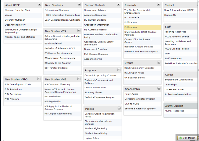
To conduct this card sorting research, we used a popular card sorting program called Websort where the participants could organize the sample pages into an information architecture that made sense to them:
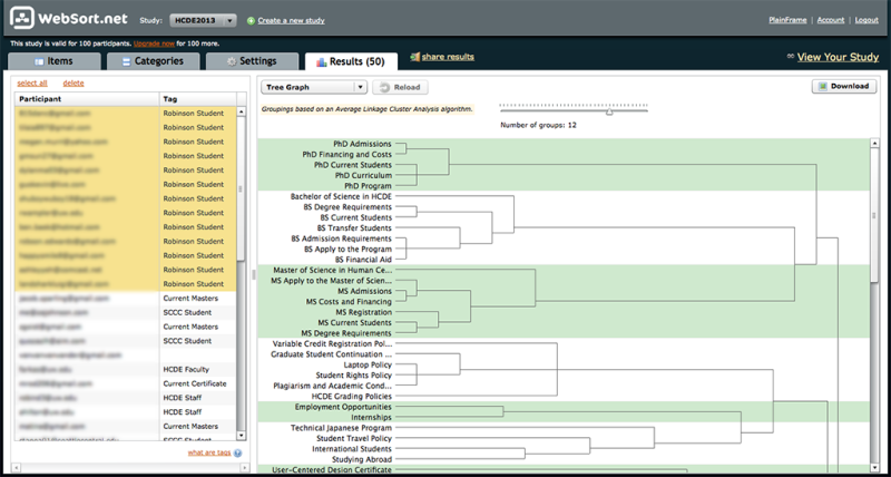
To analyze the data from the study, we began by analyzing the card groupings by user group. To do so, we were able to download tree graphs for each demographic group:
Data from these tree graphs allowed us to see, for example, that across all the user groups, degree programs, award items and research items were consistently grouped together.
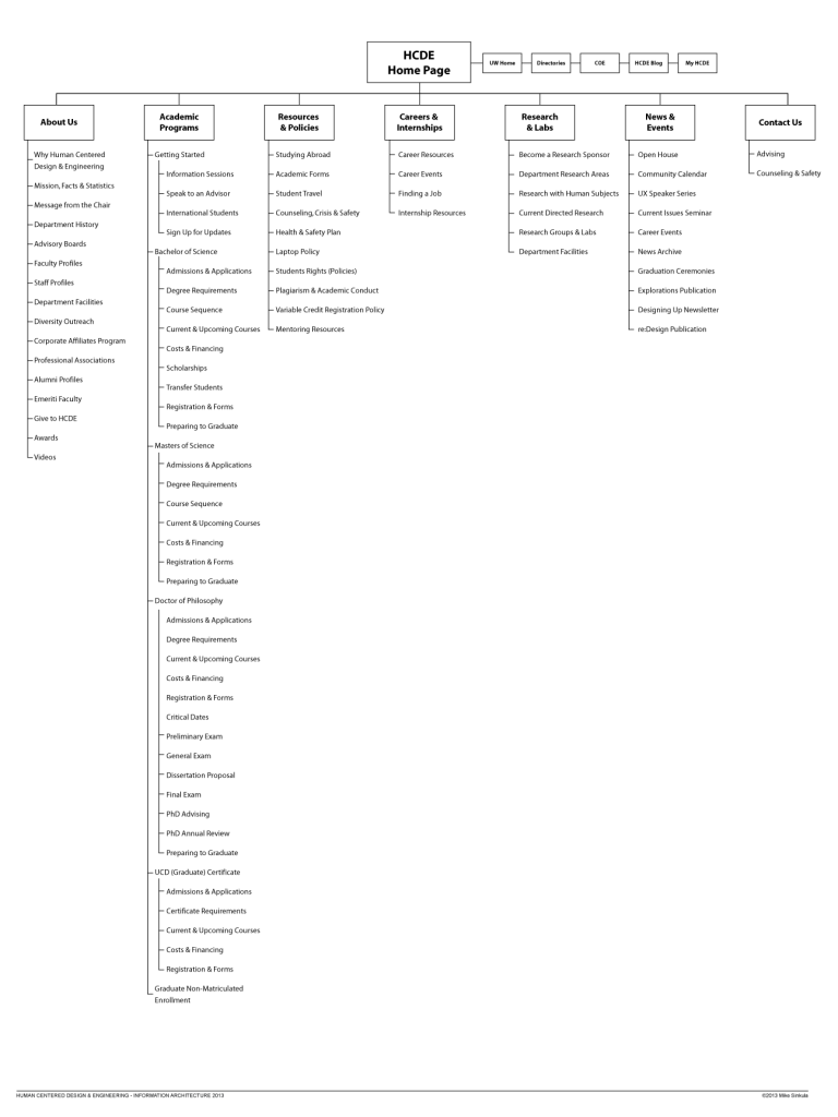
After a final white-boarding session with the Chair of the Department, the Director of Student Services and the Undergraduate Adviser, we were able to finalize the information architecture for the website:
Full Study: Card Sorting the Human Centered Design & Engineering Website Information Architecture | HCDE599 | Mike Sinkula
Visual Design & Drupal Development
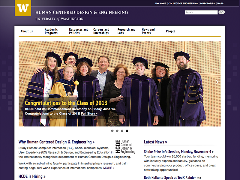
The second part of this project was to redesign the look and feel and a bit of the functionality of the website by customizing a Drupal theme that the College of Engineering had produced earlier in the year.
If you know me, you know that simplicity in design is a not only a theory that I adhere to, it is also a strategy. You may have also heard me say that, “design is nothing but solving problems according to rules and principles.” Therefore, I tackled this project with some logic to my simplicity.
The first thing that I wanted to do was to go back and revisit the University of Washington’s Brand Guidelines. From there, I found the correct colors to use when making my tints and shades for the expanded color palette. This was useful for me to create the gradient structure for the utility menu, the page background and the footer section of the website.
In terms of functionality, there were a couple of things that I wanted to change from the original theme as well. First and foremost, I thought that the current home page spotlight rotator was a bit too complex and cumbersome. Therefore, I went with something that I thought was a bit more useful.
In the past, I had used FlexSlider by Woo Themes with much success and thought it would be a nice supplement to the home page:
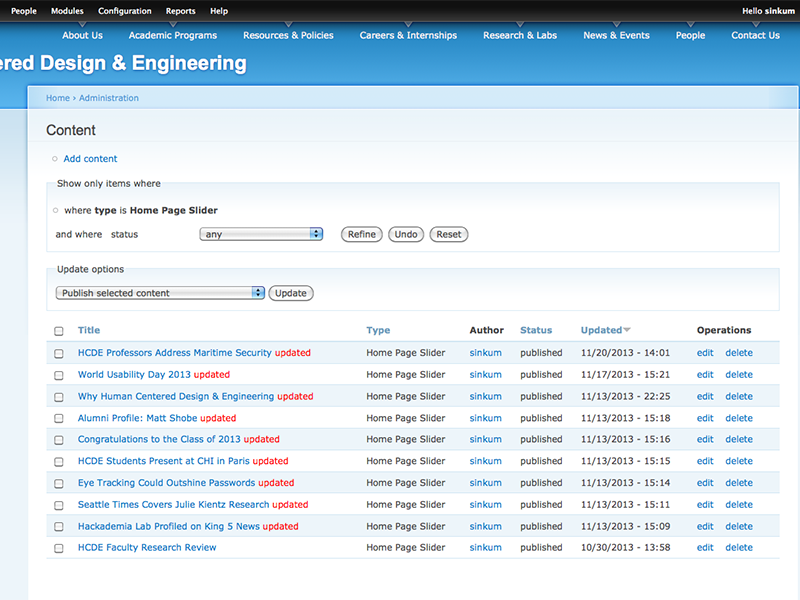
There was also a FlexSlider modual for Drupal that would allow any admin on the website to easily add content to the home page slider thru the website admin:
Overall, I am very happy with the way this project turned out. This website project is also a nice and very appropriate artifact for me to leave behind as I close out my education. It also seems that the department is happy with the new website as well.
It was a pleasure working with Mike on this project. He brought broad expertise in all areas of web development, user experience and visual design to the table. In addition to that, Mike also brought a depth of experience and knowledge that speaks to his skill as an educator and a web developer. Mike understood the complexities and limitations of working within the University of Washington’s brand guidelines, as well as within the limitations of the department’s resources. The entire department was thrilled with the result, which is serving all of the faculty, staff, and students well.
— Anne Hilton, Communications Director for the Human Centered Design & Engineering Department at the University of Washington
So, here’s to having some fun making the world a better place!

Thank you for sharing your experience Mike! I have always learned a lot from you. In web world you are my hero. Please let me know if you have presentation about card sorting at SCCC. It can help me to re-design a website more efficiently!
Thank you again!
What a superb project, Mike! Thanks for sharing and congrats on your educational perseverance. */:-)
Mike, this is incredible! I wish I knew you were in campus, as I went back to school at UW, too! I’d love to hear about your plans for next steps. Nice work!