

Convert a 960 Grid Website Layout to a Responsive Design
Posted on February 12th, 2013 in Tutorials
Shh… don’t tell anyone. But, it seems that the whole world of website content design has changed. No longer can you get away with having a website that doesn’t take into account displaying the content correctly on the whole series of mobile devices.
See Also: Considerations for Mobile Design (Part 2): Dimensions | UX Booth
So, what do you do? Do you start over from the ground up, or can that old website be converted to display the content correctly at all of the newer and smaller resolutions?
If you are anything like me as a web designer, you have really come to love the 960 Grid System over that past few years. And, you have most likely spent many an hour perfecting your website’s content to pixel perfectly align to it’s most amazing and simple 12 column grid.
See Also: 960 Grid System | Nathan Smith
You might even go so far as to steal their background image to re-purpose for your own use to make sure that everything is lining up to the grid correctly:

Using the Twelve Column Grid
So, now what? After I’ve spent a million hours designing this website and tweaking that CSS file for what seems like forever, do I really need to redo everything? The answer, quite simply, is no. No, you don’t need to start over. All you need to do is write a little more CSS and use a touch of JavaScript to make the content and navigation display differently at the different resolutions.
However, before you begin this endeavor, I recommend reading Responsive Web Design by Ethan Marcotte. It’s something that you can read in a night and it will cover all of the basics you need to know. I read this before I turned my blog into a responsive design.
The Viewport Meta Tag
The first thing that you will need to know is that you will need to have your website inform the devices how to display your content correctly.
You will need to add the viewport meta tag into your head tag:
<meta name="viewport" content="width=device-width, initial-scale=1.0, minimum-scale=1.0" />
This will allow your website to work on all of the popular mobile devices.
But, If you don’t want your website to re-scale in that funny way on the iPhone, you should turn off user scaling by using:
<meta name="viewport" content="user-scalable=no, initial-scale=1.0, maximum-scale=1.0" />
See Also:
- Using the viewport meta tag to control layout on mobile browsers – Mobile | MDN
- Mobile and Tablet Viewport Sizes with screen DPI and size | i-Skool
- Safari Web Content Guide: Configuring the Viewport | iOS Developer Library
Responsive Typography
If you come from a traditional print background, like me, you are used to always having pixel perfect control over a fixed width world.
My advice to you… get over it. I did. You are now going to have to get used to using percentages and ems in your typographic design.
See Also: Why Ems? | CSS-Tricks
The first thing that you need to do to help you get through your pain is to set all base font sizes and line heights in your body tag:
body {
    font-size: 100%; /* 16px */
    line-height: 150%; /* 24px */
    }
This will set all typographic elements on your page to a default 16px font size and a 24px line height. From there we can start to convert everything else to ems.
h1 {
    font-size: 2.25em; /* 36px / 16px */
    }

h2 {
    font-size: 2em; /* 32px / 16px */
    }
You will also want to add one more line of code into your CSS if you don’t want your body copy to re-size on your iPhone:
html { -webkit-text-size-adjust: none; }
See Also: Maintain body text size on iPhone landscape and portrait views | Valarie.info
Responsive Imagery & Media
You will also need to get used to the idea that your images and media will need to scale according to their parent elements as well.
You will need to set all image and media tags to a “max-width” of 100%:
img, embed, object, video, iframe {
    max-width: 100%;
    }
This will allow the images and media to scale down uniformly as their parent elements scale down around them. This will also overwrite any width settings declared in the image tag.
Responsive Layout with Media Queries
When it comes to making the rest of the layout, you can still leave your measurements mostly alone at screen widths above 1024px wide instead of converting everything to percentages right away. If this sounds funny to you, my reasoning is that I have experienced some issues with elements not lining up correctly when I create percentages for widths above 1024px.
Here you see the markup code for my #header element that has two child elements of #logo and #tchotchkes:
<!-- BEGIN HEADER -->
<div id="header">

    <!-- BEGIN LOGO -->
    <div id="logo">
    <a href="http://www.mikesinkula.com" title="Mike Sinkula's Home Page"><img src="<?php bloginfo('template_directory'); ?>/images/img-logo.png" alt="MikeSinkula.com" longdesc="http://www.mikesinkula.com" /></a>
    </div>
    <!-- END LOGO -->

    <!-- BEGIN TCHOTCHKES -->
    <div id="tchotchkes">
    <a href="http://www.premiumdw.com/" target="_blank" title="Link to Mike's Business Website"><img id="tchotchkes-business" src="<?php bloginfo('template_directory'); ?>/images/img-tchotchkes-business.png" alt="Mike's Business Website" /></a>
    <a href="http://www.sccc.premiumdw.com/" target="_blank" title="Link to Mike's Student Website"><img id="tchotchkes-school" src="<?php bloginfo('template_directory'); ?>/images/img-tchotchkes-students.png" alt="Mike's Student Website" /></a>
    </div>
    <!-- END TCHOTCHKES -->

</div>
<!-- END HEADER -->
The one change you will need to make, though, is to your parent layout elements. In this case I have reset my #header from a fixed width of 1000px to a “max-width” of 1000px. But, notice that I have left the child elements of #logo and #tchotchkes at their original fixed widths.
/* Desktop Screen Set to above 1024 x 768  */

#header {
    max-width: 1000px; /* change parent elements to a max-width */
    margin: 0 auto;
    overflow: hidden;
    }

#logo {
    float:left;
    width: 442px; /* you can still leave child elements at fixed width */
    }

#tchotchkes {
    float:right;
    width: 558px; /* you can still leave leave child elements at fixed width */
    text-align: right;
    }
You can use this same methodology for all other parent layout elements that contain child elements.
Here you see the markup code for my #middle element that has two child elements of #content and #sidebar :
<!-- BEGIN MIDDLE -->
<div id="middle">

    <!-- BEGIN CONTENT -->
    <div id="content">

    <!-- Written Content Goes Here -->

    </div>
    <!-- END CONTENT -->

    <!-- BEGIN SIDEBAR -->
    <div id="sidebar">

    <!-- Sidebar Content Goes Here -->

    </div>
    <!-- END SIDEBAR -->

</div>
<!-- END MIDDLE -->
I have then reset my #middle element from a fixed width of 940px to a “max-width” of 940px and have left the child elements of #content and #sidebar at their original fixed widths. Notice that the background image for the #middle element is set to scale too by setting the background size to 100%:
#middle {
    max-width: 940px; /* change parent elements to a max-width */
    margin: 0 auto;
    padding: 10px 30px;
    background: url(images/bg-middle.png) top center repeat-y;
    background-size: 100%; /* this allows the background image to scale relatively */
    overflow: hidden;
    }

#content {
    float:left;
    width: 620px; /* you can still leave child elements at fixed width */
    }

#sidebar {
    float: right;
    width: 278px; /* you can still leave child elements at fixed width */
    border: 1px solid #CAC5B9;
    border-radius: 10px;
    background-color: #FBF9F6;
    padding: 20px 10px;
    }
It isn’t until you get to a resolution below 1024px wide that you will need to convert all child element widths to a percentage of their parent element widths so that they will start to responsively scale:
/* Desktop & Mobile Screens Set to 1024 x 768 or Below  */
@media screen and (max-width: 1024px) {

#logo {
    width: 44.2%; /* 442px / 1000px */
    }

#tchotchkes {
    width: 55.8%; /* 558px / 1000px */
    }

#tchotchkes-business {
    position: relative;
    margin-right: -40px;
    z-index: 10;
    width: 36.2007168458781%; /* 202px / 558px; */
}

#tchotchkes-school {
    position: relative;
    z-index: 5;
    width: 36.9175627240143%; /* 206px / 558px; */
    }

#middle {
    padding: 10px 3%; /* 30px / 1000px */
    }

#content {
    width: 65.9574468085106%; /* 620px / 940px */
    }

#sidebar {
    width: 29.5744680851064%; /* 278px / 940px */
    padding: 20px 01.063829787234%; /* 10px / 940px */
    }

}
With all of these elements set in motion to scale responsively now, you should see your site start to scale down at smaller resolutions! However, you will also need to make some adjustments to your design at some of the smaller resolutions.
For instance, as my site scales down, there comes a point in time where having the #logo and #tchotchkes elements and the #content and #sidebar elements floated next to each other either doesn’t fit anymore or just becomes too unbearable to look at.
Therefore, I have chosen to hide the #tchotchkes element and reset the size and placement of the #logo element. I will also need to set the #sidebar element to clear underneath the #content element.
For this design, I have chosen the break-point of 600px wide to do such a thing.
/* Desktop & Mobile Screens Set to a Width of 600px or Below */
@media screen and (max-width: 600px) {

#logo {
    margin: 0 auto;
    float: none;
    width: 75%;
    }

#tchotchkes {
    display: none;
    }

#sidebar, #content {
    float: none;
    width: auto; /* reset the width to follow it's parent element */
    }

}
Responsive Navigation
Now, to deal with the navigation scheme.
In short, there are many different ways in which a designer can choose to deal with how the navigation scheme behaves at the smaller resolutions.
See Also: Responsive Navigation Patterns | Brad Frost Web
Because my blog gets separated into two distinct navigation schema of “pages” and “categories” I have chosen to go with the “select menu” approach.
In order to set this up, I will need to create the markup for the select menu navigation using the WordPress functions of ‘drop-down pages‘ and ‘drop-down categories.’ I will also need to dynamically create links from the select menu options to both pages and categories that are pulled from WordPress page and category IDs using a bit of JavaScript.
If this looks a little intense, it is because the only way to have a select menu work without a submit button is to use JavaScript:
<nav class="select">

<?php

    $pageslabel = array('show_option_none' => 'Pages:');

    wp_dropdown_pages($pageslabel); // creates the dropdown list of pages in WordPress with a label of 'Pages:'

?>

<script type="text/javascript">

    var pageDropdown = document.getElementById("page_id");

    function onPageChange() { // creates the link to the page's id

        if ( pageDropdown.options[pageDropdown.selectedIndex].value > 0 ) {

            location.href = "<?php echo get_option('home'); ?>/?page_id="+pageDropdown.options[pageDropdown.selectedIndex].value;

        }

    }

    pageDropdown.onchange = onPageChange;

</script>

<?php

    $categorieslabel = array('show_option_none' => 'Categories:');

    wp_dropdown_categories($categorieslabel); // creates the dropdown list of categories in WordPress with a label of 'Categories:'

?>

<script type="text/javascript">

    var catDropdown = document.getElementById("cat");

    function onCatChange() { // creates the link to the category's id

        if ( catDropdown.options[catDropdown.selectedIndex].value > 0 ) {

            location.href = "<?php echo get_option('home'); ?>/?cat="+catDropdown.options[catDropdown.selectedIndex].value;

        }

    }

    catDropdown.onchange = onCatChange;

</script>

</nav>
The HTML output that the WordPress functions of ‘drop-down pages‘ and ‘drop-down categories‘ produces looks like this:
<select name='page_id' id='page_id'>
    <option value="">Pages:</option>
    <option value="2">About</option>
    <option value="167">Contact</option>
    <option value="658">Movies</option>
    <option value="763">Music</option>
    <option value="662">Photos</option>
</select>

<select name='cat' id='cat' class='postform' >
    <option value='-1'>Categories:</option>
    <option value="1">Events</option>
    <option value="3">Vacations</option>
    <option value="5">The Dog</option>
    <option value="7">The House</option>
    <option value="10">Work</option>
    <option value="11">The Boy</option>
    <option value="12">School</option>
    <option value="13">The Cats</option>
    <option value="14">Life</option>
    <option value="18">The Family</option>
</select>
Now that I have my navigation working correctly, It is simply a matter of hiding the traditional navigation and displaying the select navigation and styling it a bit at the break point of 600px wide:
/* Desktop & Mobile Screens Set to a Width of 600px or Below */
@media screen and (max-width: 600px) {

#menu {
    display: none;
    }

#middle nav.select {
    display: block;
    margin-bottom: 20px;
    overflow: hidden;
    }

#page_id {
    float: left;
    width: 48%;
    }

#cat {
    float: right;
    width: 48%;
    }

}
And, as Bob is your Uncle, I now have a responsively designed website for mobile devices!
I am so glad that Mike modified his website for mobile devices. Now, I can see all of the new cute pictures of Gus from my phone!
— Buddy Sinkula, Jr.
I hope this tutorial helps you to convert your 960 grid website to a responsive design that works on all of the mobile devices.
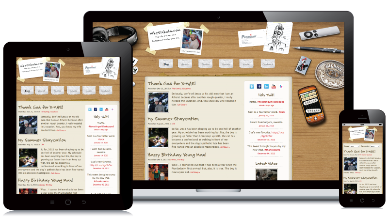
View Website: http://www.mikesinkula.com/
View Code: https://github.com/msinkula/mikes-desk-mess


Beautiful Work.
When are you gonna get around to making our website responsive?
[…] help me, I referenced this useful tutorial, also by my coworker Mr. […]
it is very useful tutorials thanks man tohave good work keep it up like this work….Thanks
Great way to describe the change, thanks.
Nice tutorial; interesting ideas. Would like to see the code boxes wrap the lines within the boxes, so that all the code can be viewed (or printed; sometimes hardcopies are useful).
I finally got around to doing that. 😉
[…] http://www.premiumdw.com/case-studies/convert-a-960-grid-website-to-a-responsive-design/ […]
You are missing the Media Queries Headline in this article
I have noticed you don’t monetize your page,
don’t waste your traffic, you can earn extra cash every month because
you’ve got high quality content. If you want to know how to
make extra money, search for: best adsense alternative Wrastain’s tools