Visual Design Studies
Posted on February 8th, 2014 in Jet City Improv
Notes:
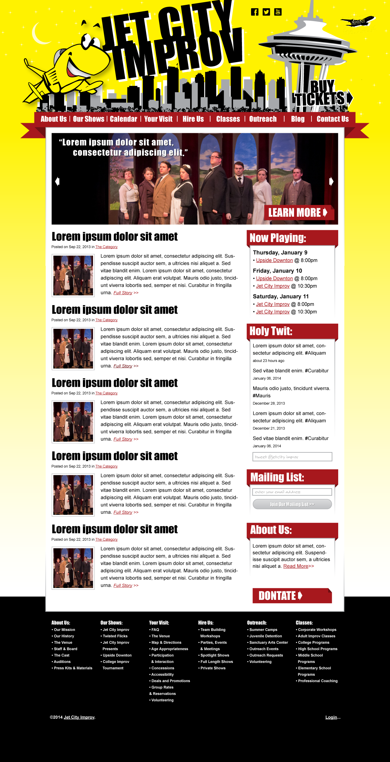
Our logo: We get by on the same Photoshop files on our end over and over again, and I hope what we have is going to work. Our official logo is the jet with the ring around him, which includes our name. Billy is not to be “naked” going forward, meaning without his ring and our titles. It may be that we do not need the words “jet city improv” next to the logo, as they are used in the logo itself. I am working on getting you a higher resolution version, but I do not know a lot about the type of files you need to make this work. This is maybe another larger conversation I have with the design team?
Our typeface/slogan: Gotham black is the font on the front of the building and at the heart of our print materials. When we move to the logo that includes the ring around him, the space could be used for a more subdued listing of our slogan: “A Higher Plane of Comedy.”
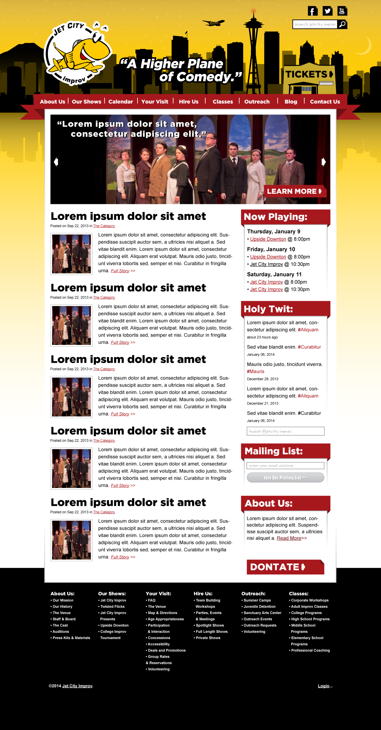
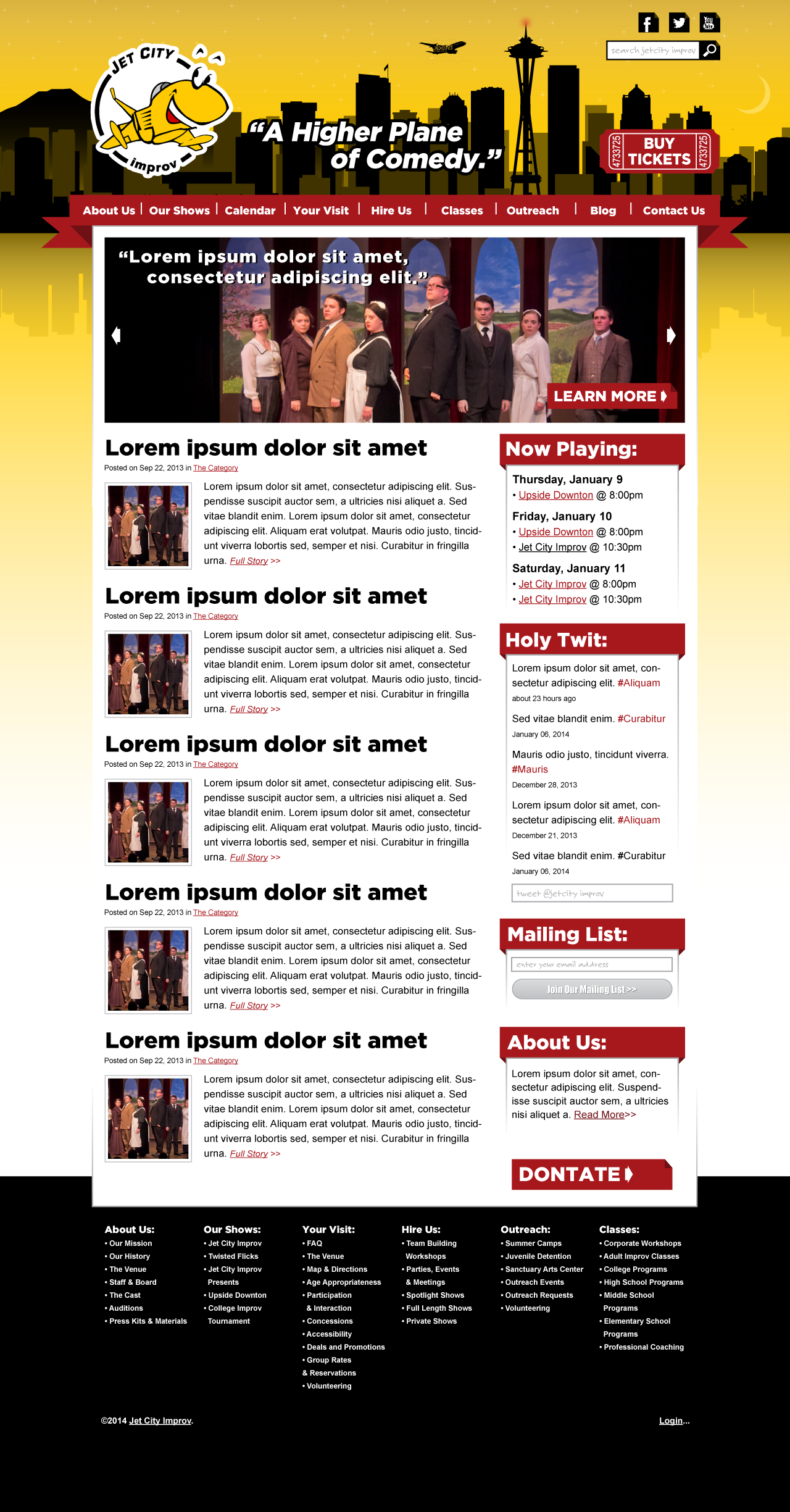
The theater in the landscape: we had, at one point, talked about putting our theater within the landscape of the city, or using it for the shape of the “buy tickets” button. Could this still be incorporated? Our theater also has our name on it, so then we really wouldn’t want it written next to the logo.
Tweaks we’d like to try
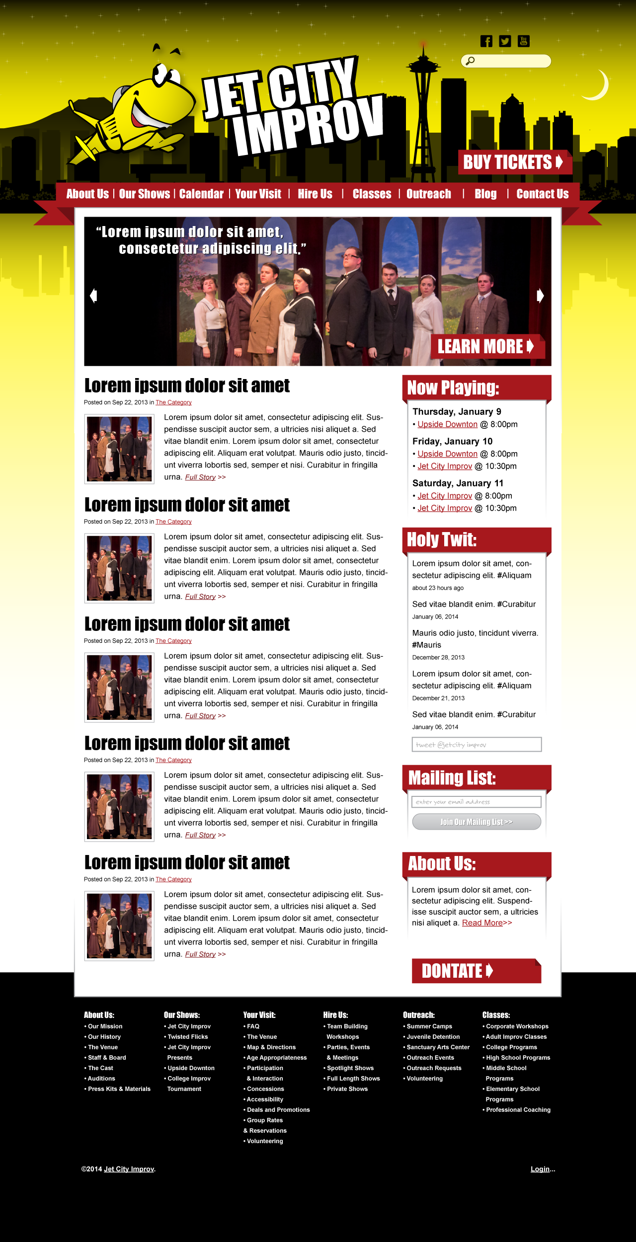
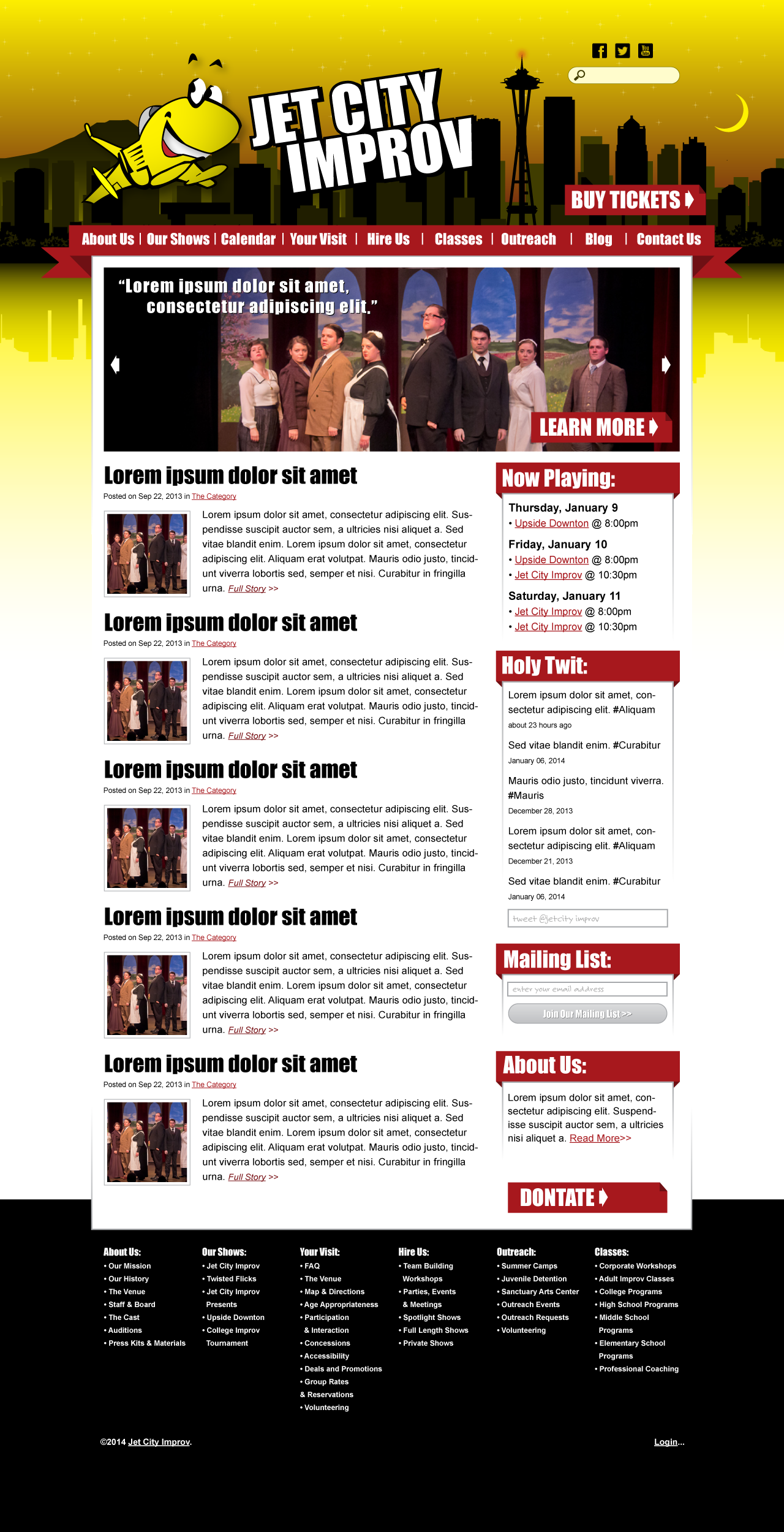
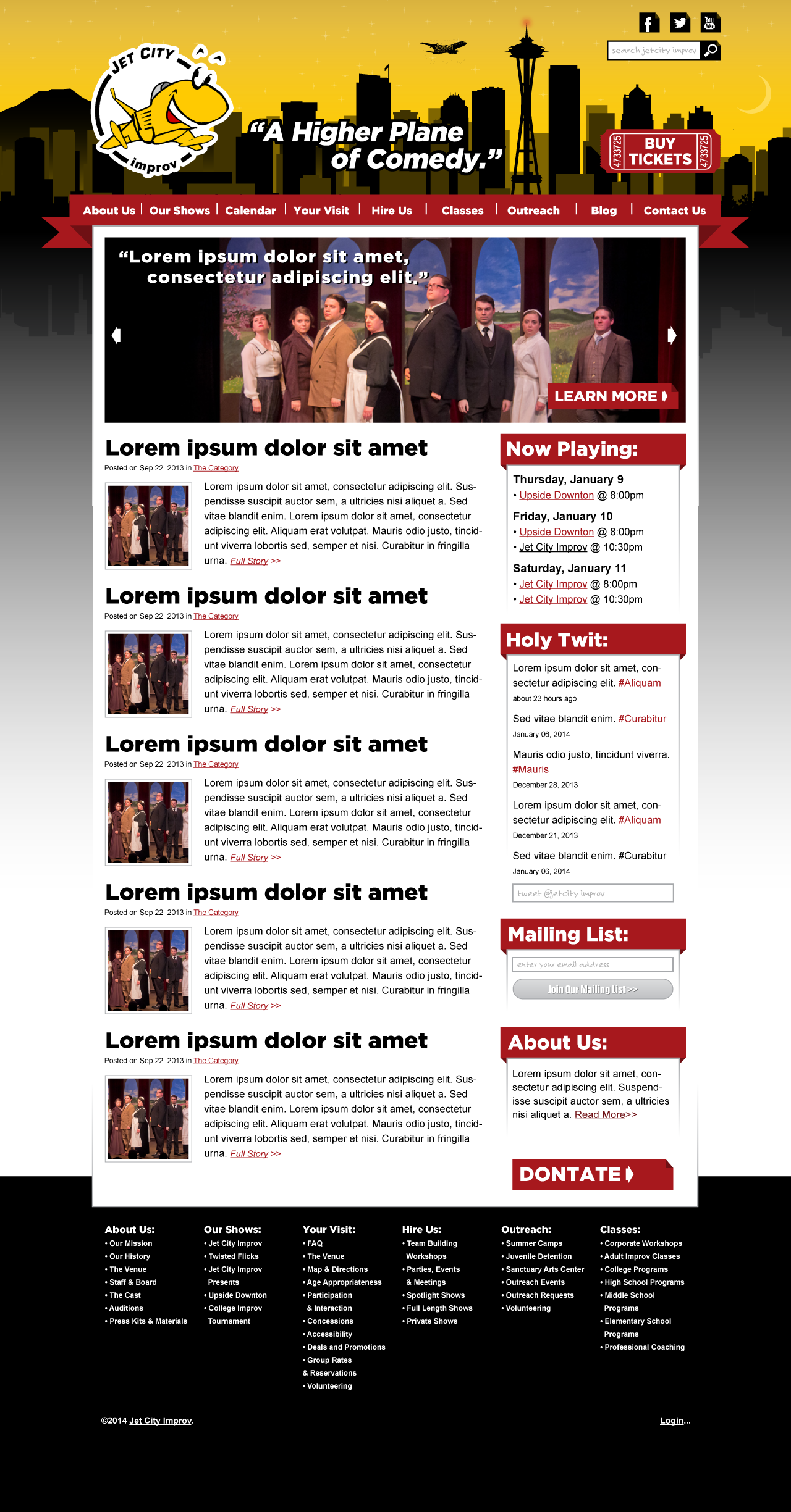
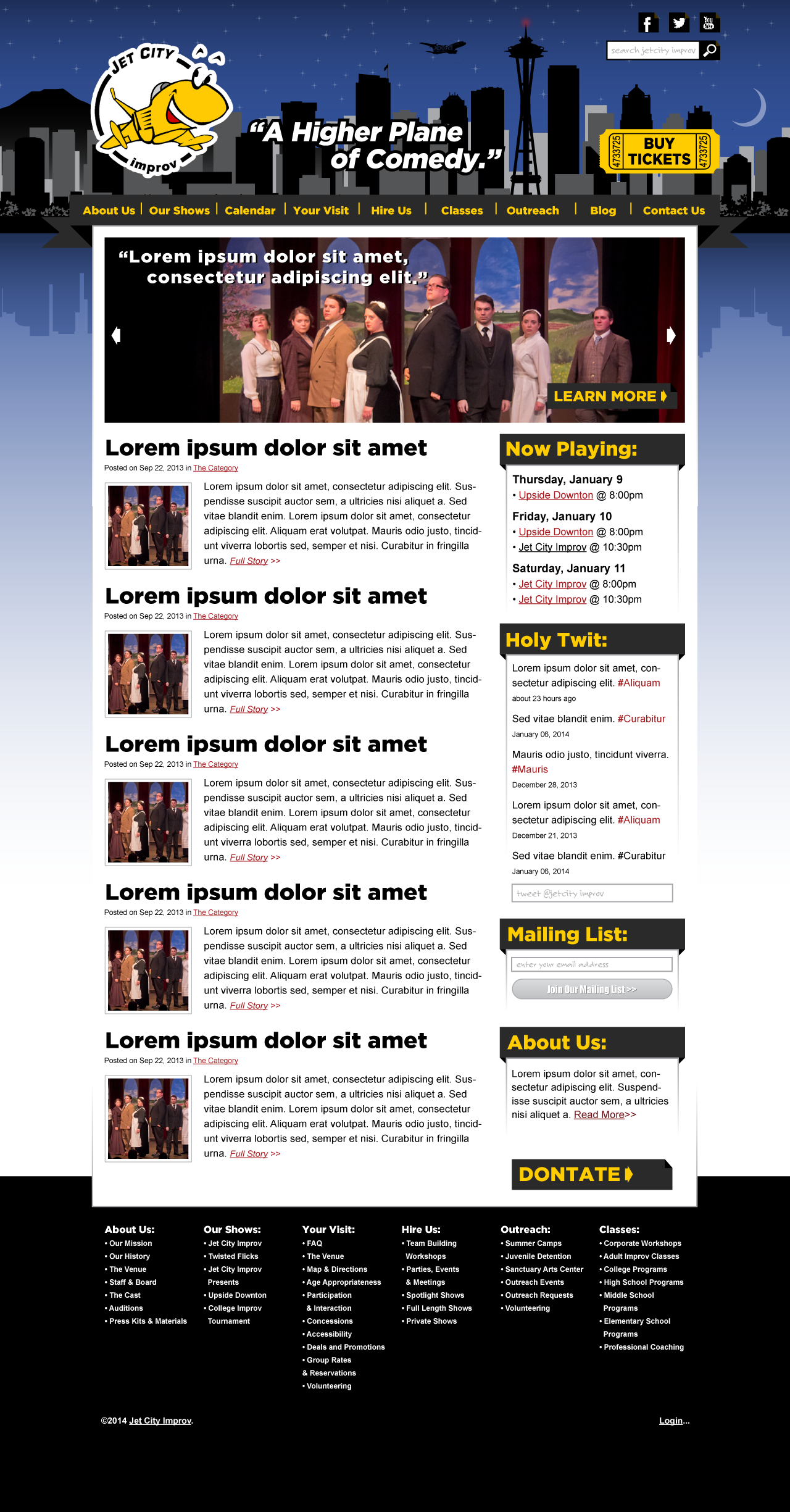
A1 with overall richer, more golden yellows (#ffcc00 or darker):
A1 with the same color sky but (dark?) grey for the “water” beneath the skyline:
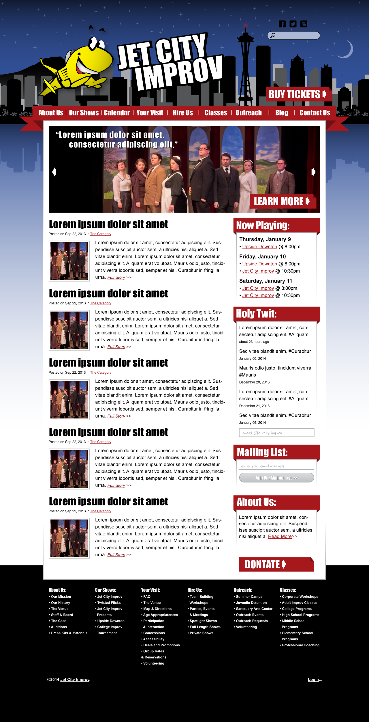
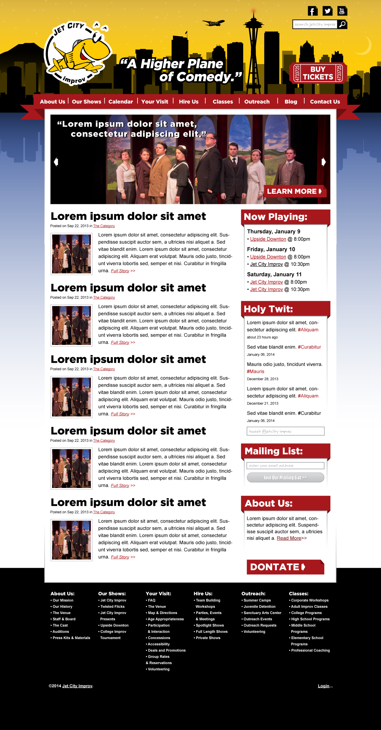
A1 with the same color sky but blue for the “water” beneath the skyline:
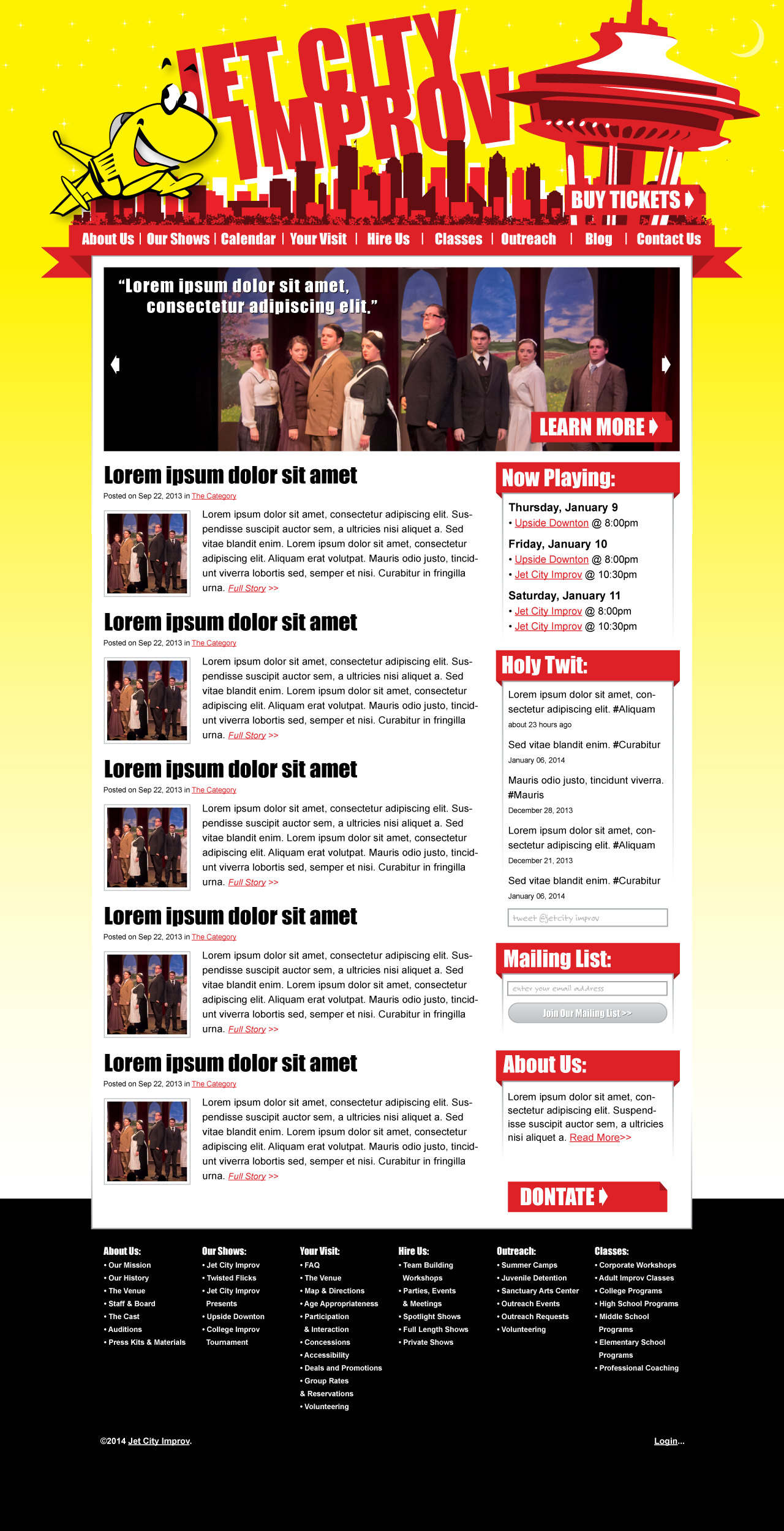
Original A3 with correct logo:
A3 with golden yellow (#ffcc00) menu/banners with black lettering:
A3 with black menu/banners with golden yellow lettering:
A3 with dark grey menu/banners with golden yellow lettering:
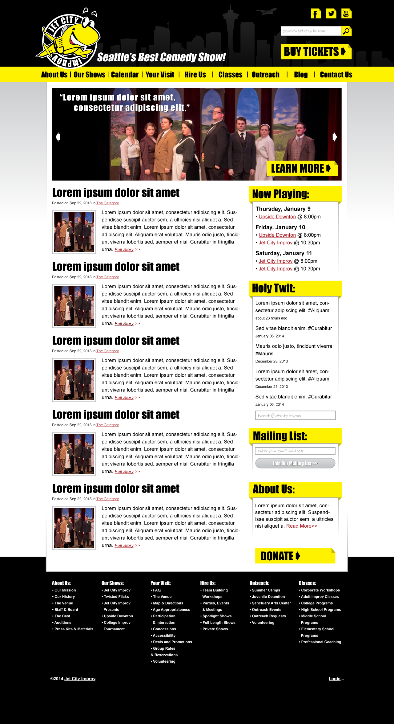
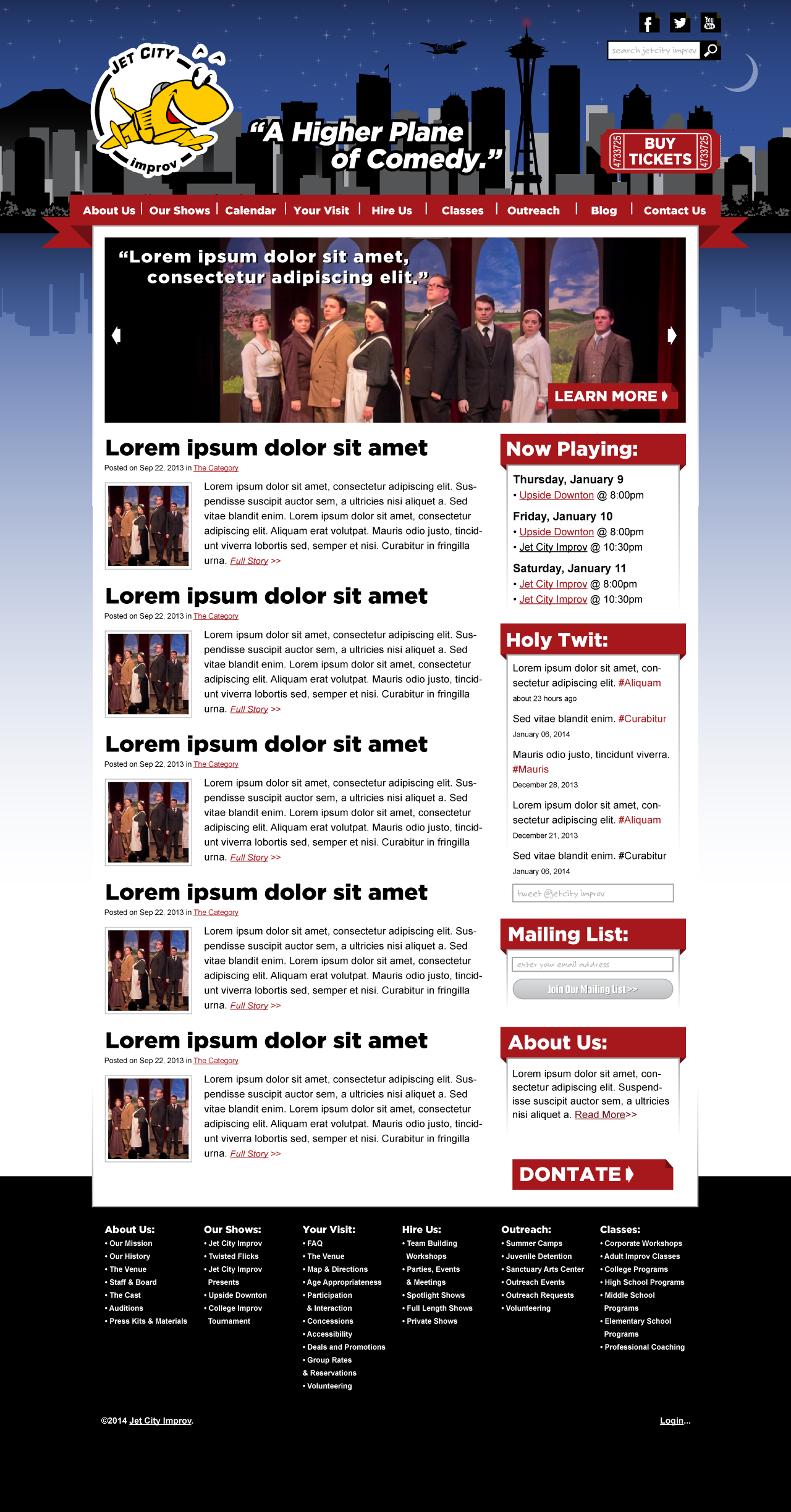
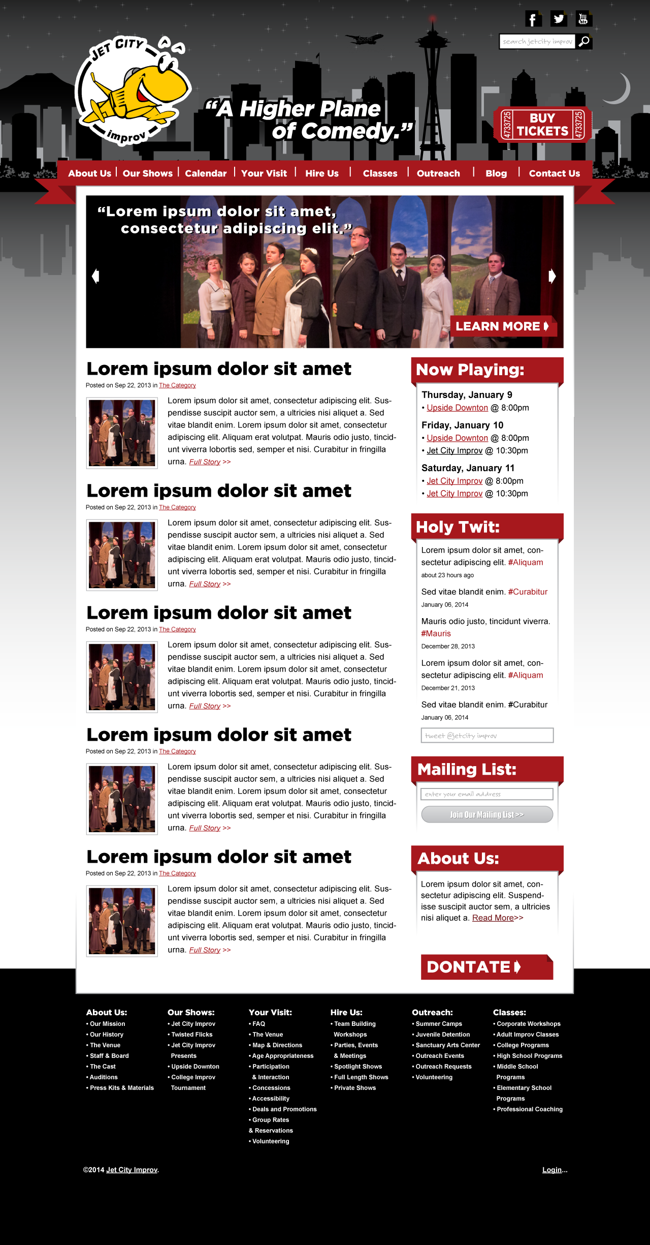
The “A” design done with blacks, greys and whites for the graphic/background and keep the red menu/banners:
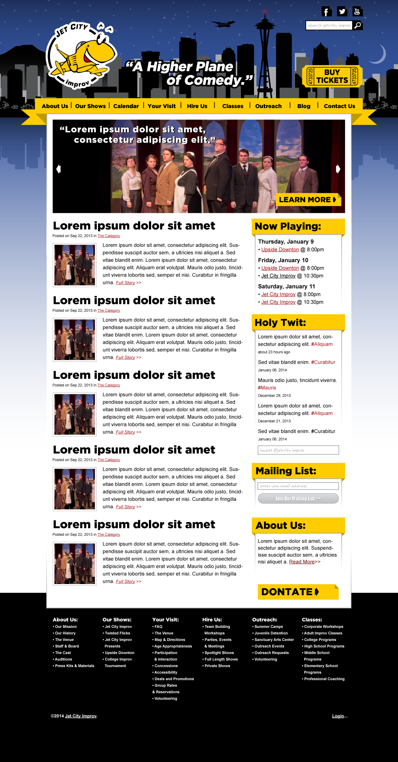
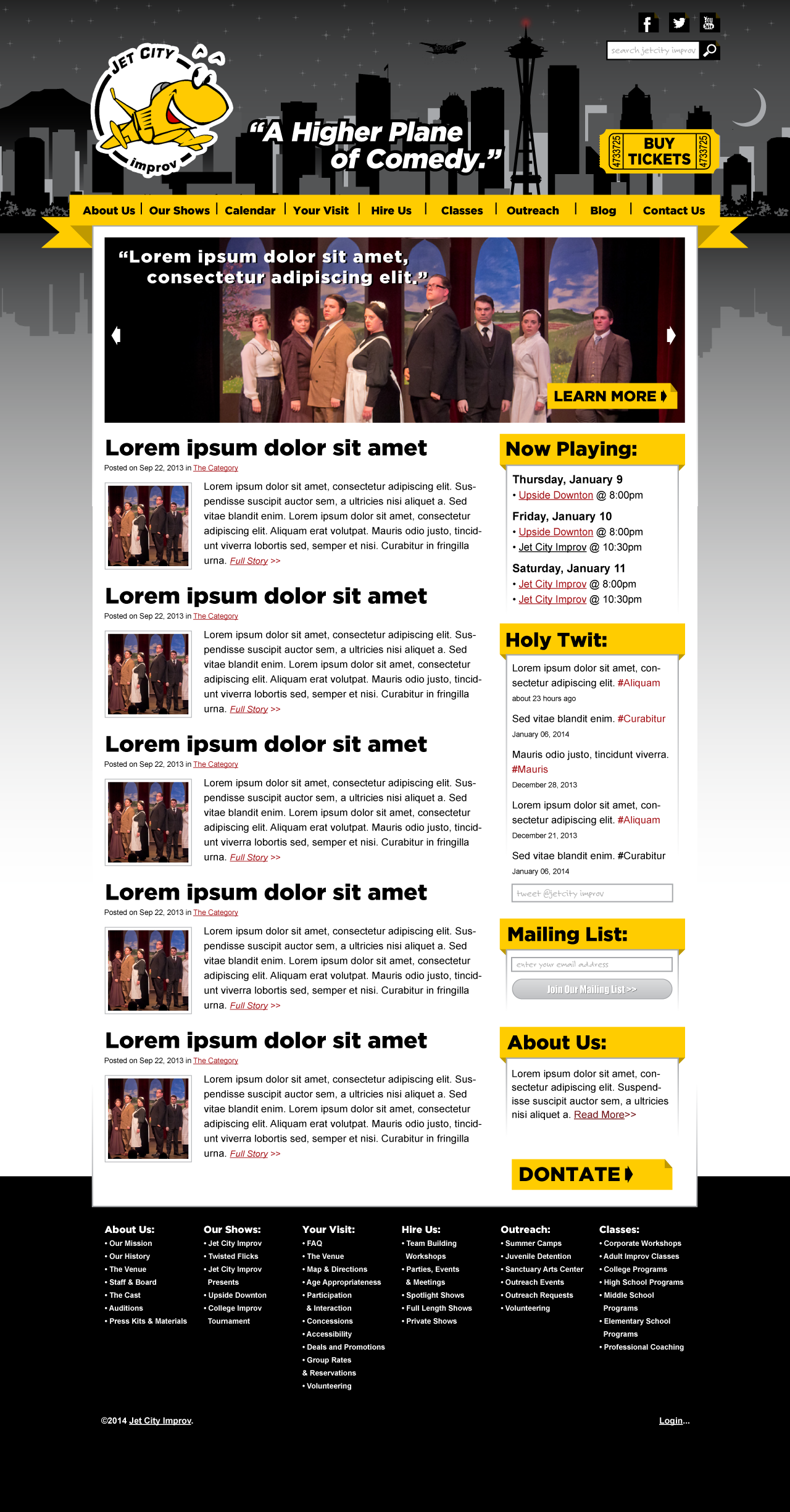
The “A” design done with blacks, greys and whites for the graphic/background with golden yellow menu/banners:

